

As part of the fifth project of the UX/UI Design Bootcamp at Ironhack, we were asked to conduct user research to understand people's relationship with mental, physical, and emotional well-being, in order to develop a native app that will motivate them to take action.
I shared this project with Sara Pérez as a UX/UI Designer.
4 weeks part-time (during March 2022)
The National Wellness Institute, our client, is very excited to explore how they can leverage technology to help people live a healthier life.

The board realized that the possibilities are endless when it comes to translating the concept of wellness into a digital product. This is why they have set up a competition for the upcoming conference.
Designers will do user research to find out what tools people need, develop a prototype, and pitch their ideas. The winning concepts will be presented at the conference and developed into the first digital tools that NWI will offer.
After discussing the challenge and considering the project requirements and our client’s needs, we decided to create an app focused both on nutrition and physical activity as we sympathize with the holistic approach of the National Wellness Institute.
As we have to choose a platform for the native app, we agreed to design for the iOS system. The main reason for this decision was to keep researching and improving as designers with the Human Interface Guidelines from Apple.
Before empathizing with users, we first wanted to know what’s happening in the market to identify opportunities and put our efforts into creating value with our app.
As we agreed before, we decided to combine nutritional and physical activity features on our app. Therefore, we decided to identify the most downloaded apps on the App Store in the nutrition and physical activity categories.
We identified the following apps: Fitia, MyFitnessPal, Freeletics, BetterMe, and 8fit.
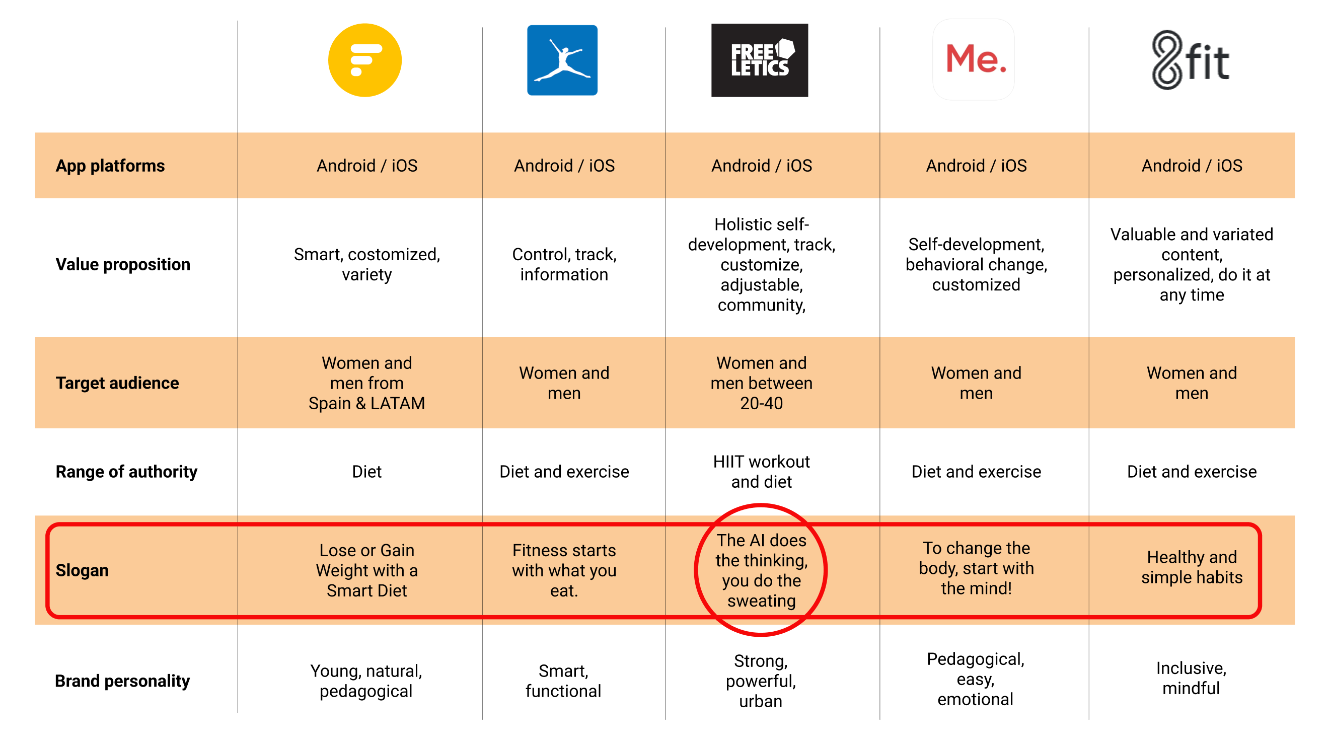
After the brand research, we conclude that most of them tend to use a pedagogical point of view, suggesting to the users that they will learn something new while achieving their goals. However, each brand uses different approaches, like: “Lose or gain weight with a smart diet”, “To change the body, start with the mind”, “Fitness starts with what you eat”, etc.
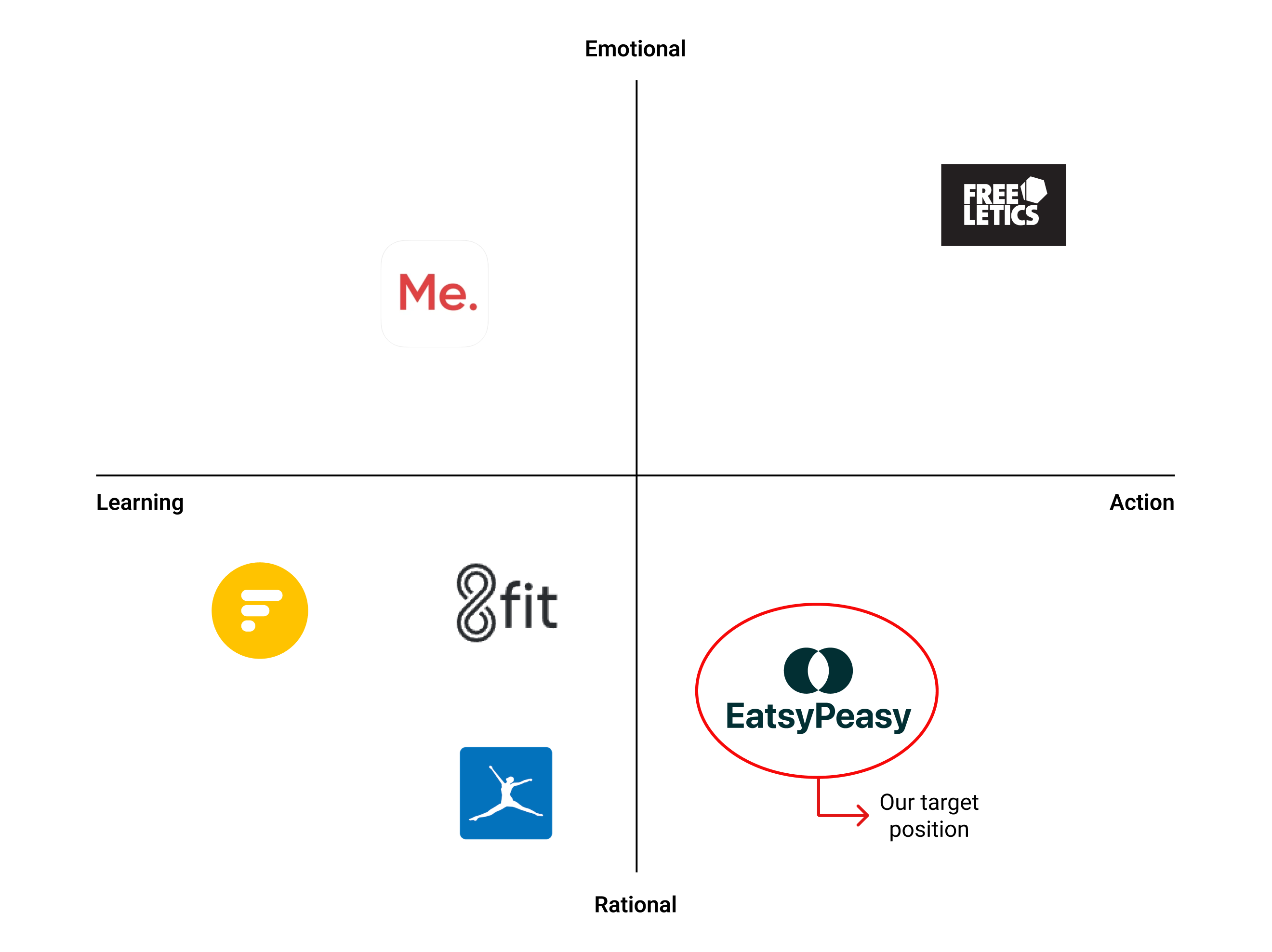
The only brand that stands out from this pedagogical point of view is Freeletics, which goes opposite: “The AI does the thinking, you do the sweating”. Therefore, we can see that Freeletics focuses on action and leaves aside the user’s learning.
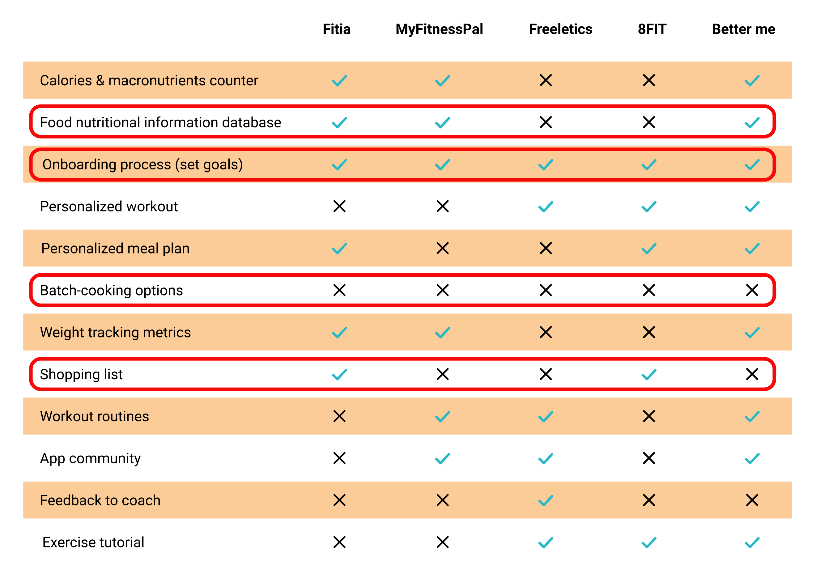
This table shows 12 out of 22 features we compared between these five fitness & nutrition apps. All these apps have an onboarding process to set the goals, so we couldn't afford to miss this feature to be competitive.
As we had to focus on one particular point of the wellness app, we decided to compare features related to the nutrition aspect (in the following user research results, we will see why).
Following the comparison, we saw that the apps focused on the workout part don’t offer a food nutritional information database or shopping list for their users. In addition, none of these apps provides batch-cooking options, an important feature that we will explain later.
We built a twelve-question survey to measure and categorize attitudes that could help us discover important physical activity and nutrition issues.
We used Google Forms to build and share the survey. As we were in a Bootcamp context with a limited timeframe, we only had time to collect 31 responses. Therefore, we must not cherry-pick this data and draw hasty conclusions, so we contrasted it with qualitative insights gathered during the interviews.The survey responses pointed to the following insights:
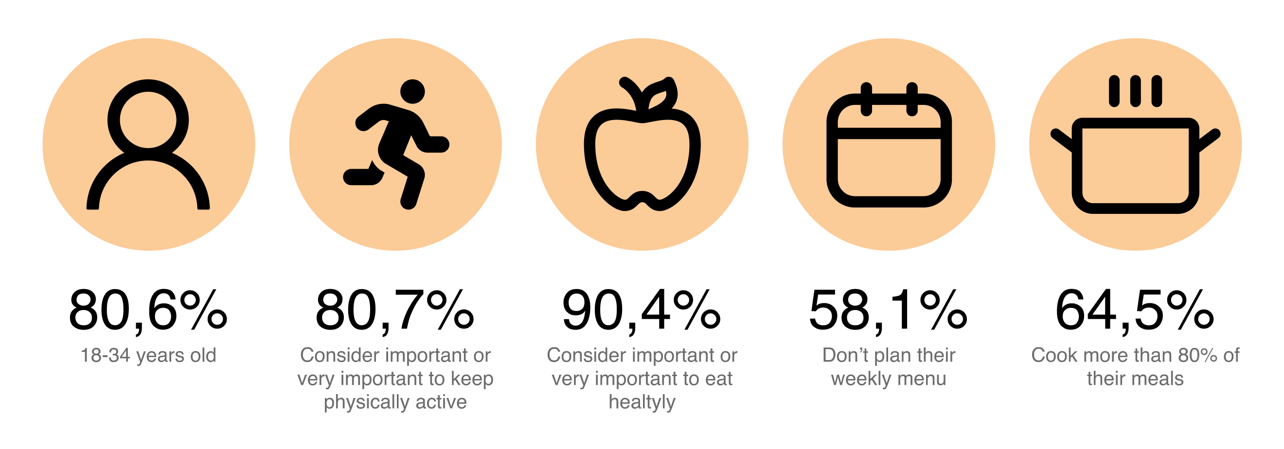
Most people consider it important or very important to keep physically active. When we ask how many days they exercise per week, 32,3% do it from 1 to 2 times per week, and 41,9% from 2 to 3 times per week. The most practiced activities are walking, running, gym and yoga, and the main motivations are to feel good and keep in shape.
The vast majority consider nutrition important or very important. However, only 58,1% plan menus, and 64,5% cook the majority of the meals by themselves. Besides, only 53,3% have read a book or an article related to nutrition in the last three months.
For the qualitative research, we interviewed five people between 25-38 years old that considered important to keep a healthy lifestyle.
Some relevant quotes we gathered during the interview:
"Physical and mental health is important for a healthy lifestyle to me. There are fundamentals: food, physical activity, and rest." — Laura, 25.
“60% or 70% is because I want to be healthy. I improve my health by doing exercise. The other 30% is to have a better body.” — Kathy, 30.
“When I start eating healthy, I feel I have to cook and spend more time than maybe I don’t have, so that’s why I end up buying prepared food.” — Tineke, 38.
“There is a lot of information and different opinions, but without a scientific background” — Kathy, 30.
To focus the attention on users’ motivations and desired outcomes, after the interviews, we defined three jobs to be done statements:
When I plan my weekly exercise, I want to have a balanced diet according to my activity, so I can keep my body shape and feel better.
When I’m working, I want to eat quickly but healthy, so I can keep a good balance with my physical activity.
When I am planning my meals, I want to know what to cook, so I can save time on deciding and buying in the supermarket.
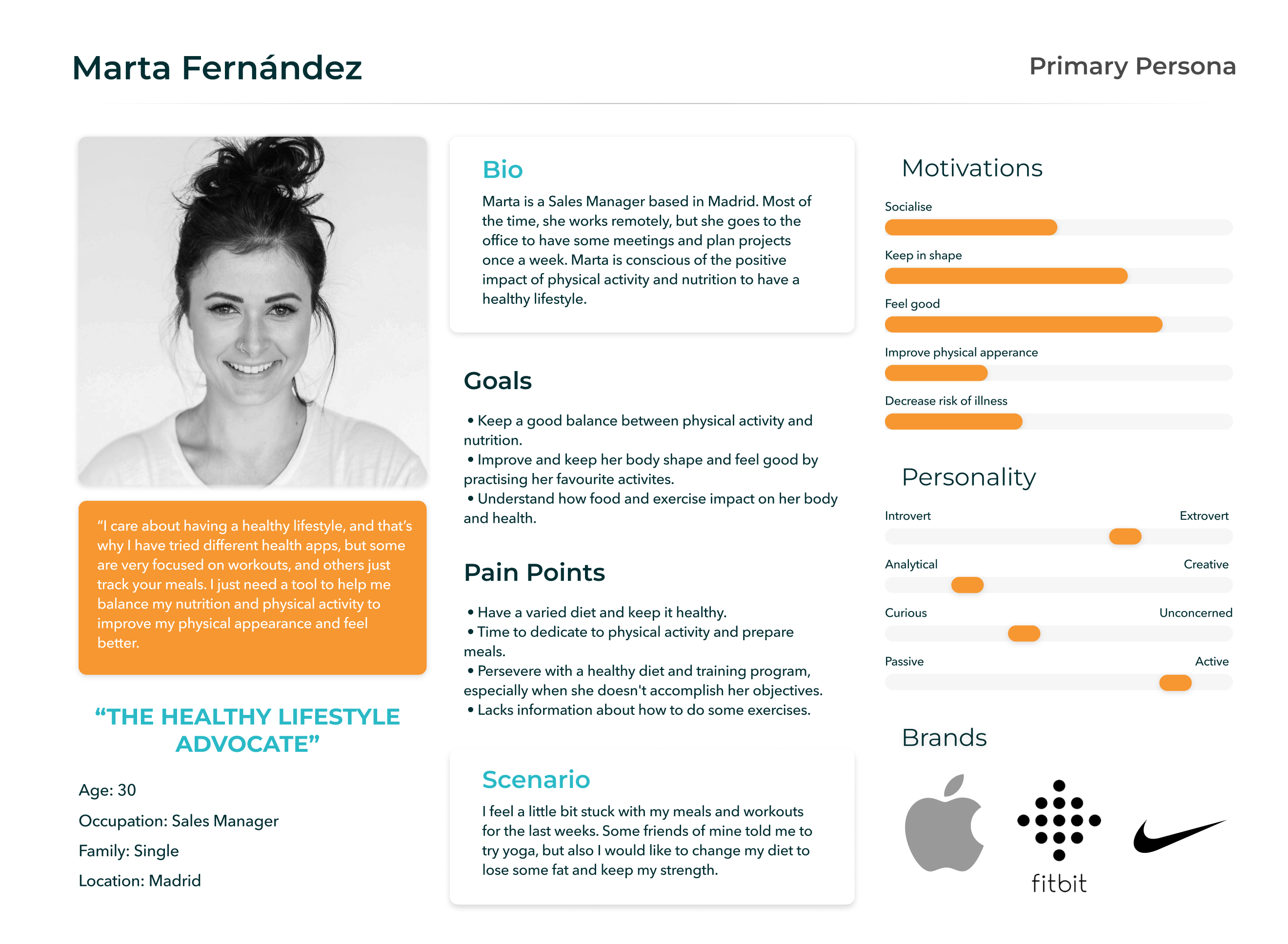
We created Marta, our primary user persona, to share our final user understanding:
Here's Marta's journey to keep a physical activity and nutrition balance:
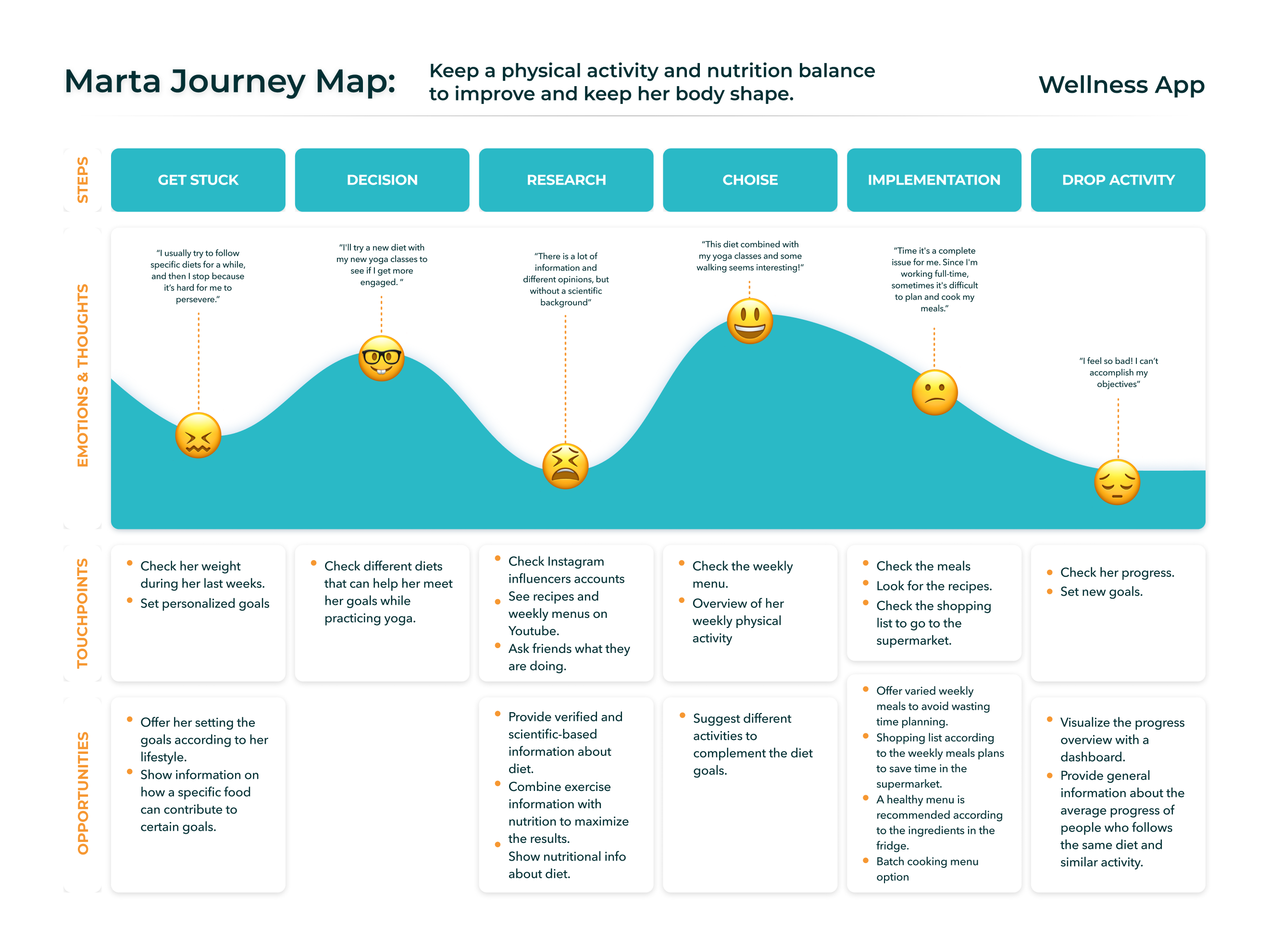
During Marta’s journey, we have spotted some opportunities:
To define the issue and project’s main objective, we agreed with this problem statement:
Healthy lifestyle advocates need to find a way to maintain physical activity and nutrition balance to keep in shape because they don’t have time to plan and cook the meals.
To prove our assumptions, we defined this hypothesis statement:
We believe offering weekly meals according to users’ activities and goals for healthy lifestyle advocates will achieve high engagement of users. We will know we are right with 80% of users retention.
Considering Martas’s goals, we defined three How Might We questions to turn problems into opportunities.
Once we defined the problem, we brainstormed to ideate new features based on the three HMW questions to improve Marta’s experience. With the Moscow Method, we prioritized the vital features to include on the app first, based on Marta’s immediate needs and opportunities based on her pain points.
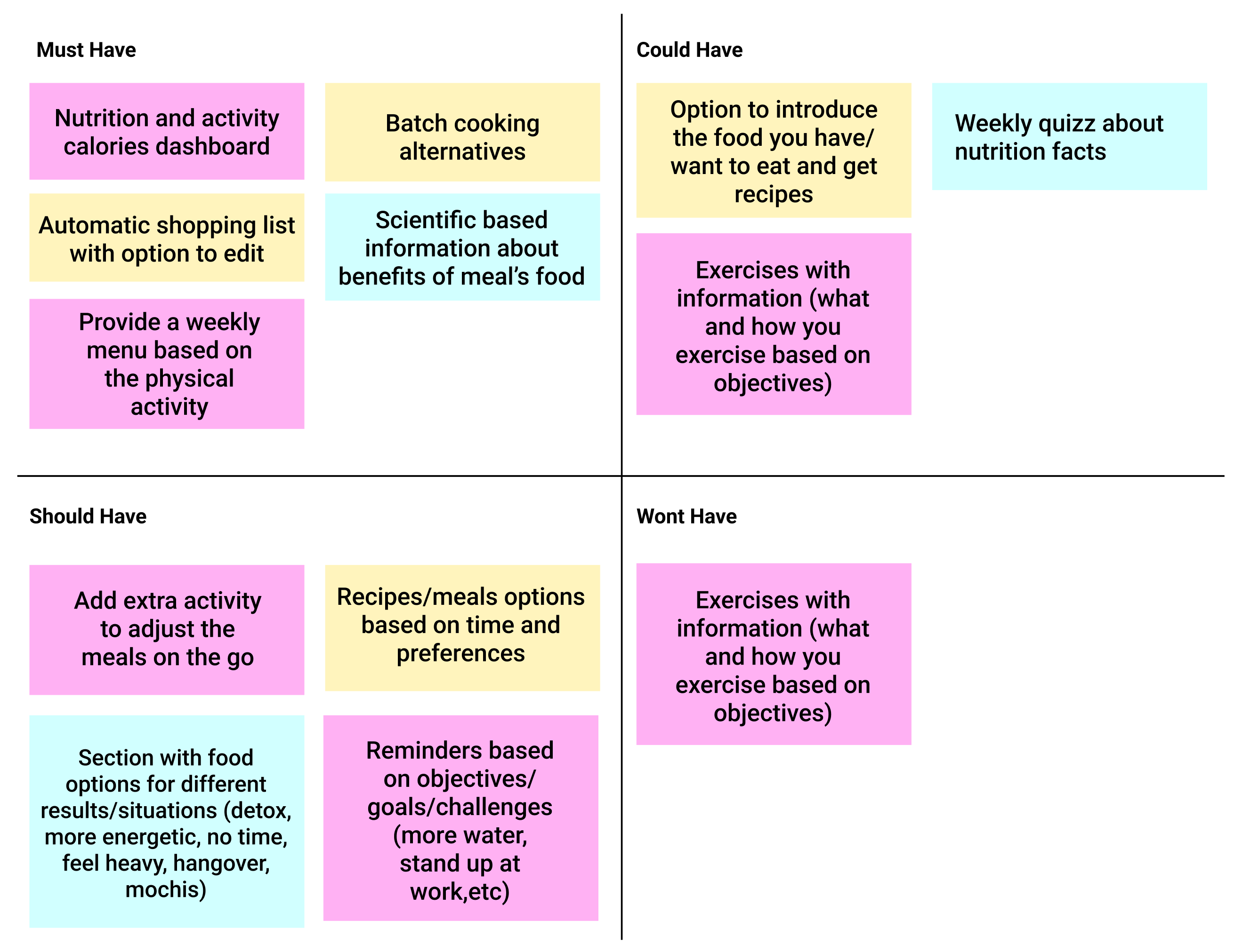
According to Marta’s needs, we decided to prioritize the following features:
That led us to define the Minimum Viable Product (MVP):
The goal of the EatsyPeasy app, at the bare minimum, is to help users to maintain the balance between physical activity and nutrition to keep a healthy lifestyle. The app suggests customized weekly menus to help users reach their goals by tracking their physical activity. Therefore, we must do the following:
Create a dashboard, suggest menus according to the users’ available time and activity, and offer scientific-based nutrition facts to engage users to accomplish the objectives.
By offering batch cooking options and an automated shopping list, users can save time to prepare their healthy meals.
Information architecture-wise, we started designing the sitemap to create a hierarchy and structure for the app.
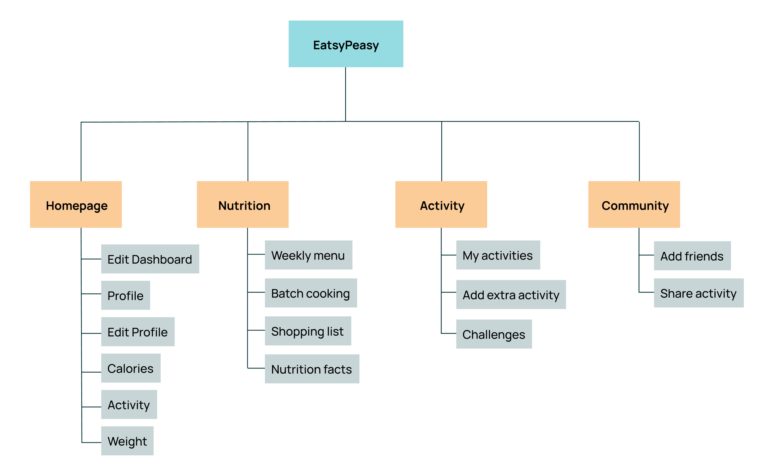
We wanted to create four sections to make it easy for Marta to navigate through the app. The homepage section includes the dashboard with all the relevant metrics and the edit options to customize the dashboard or change the profile’s information.
Nutrition and activity have sections with specific information regarding each topic. On the other hand, we also ideated a community area where Marta will connect with friends and share her activity.
The happy path created for Marta will consist of completing the onboarding, turning the weekly menu into a batch-cooked one, and checking the avocado’s nutritional information inside the shopping list. As a disclaimer, here we are not considering the sign-up screens and all the screens inside the onboarding.
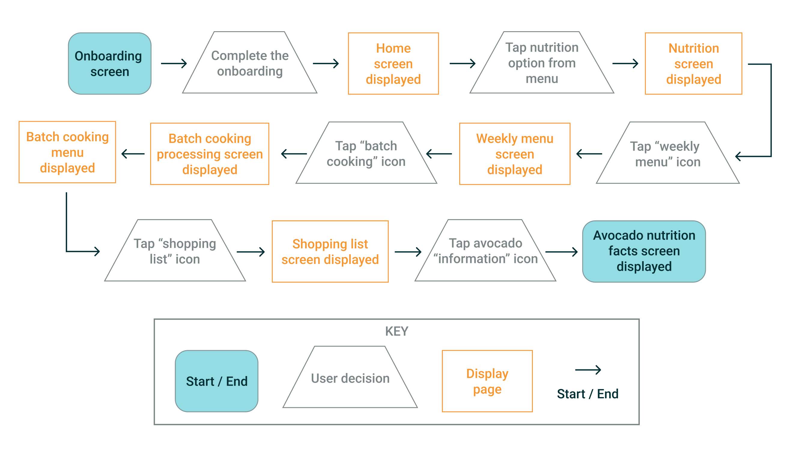
With the sitemap and user flow clear, we started sketching the screens.
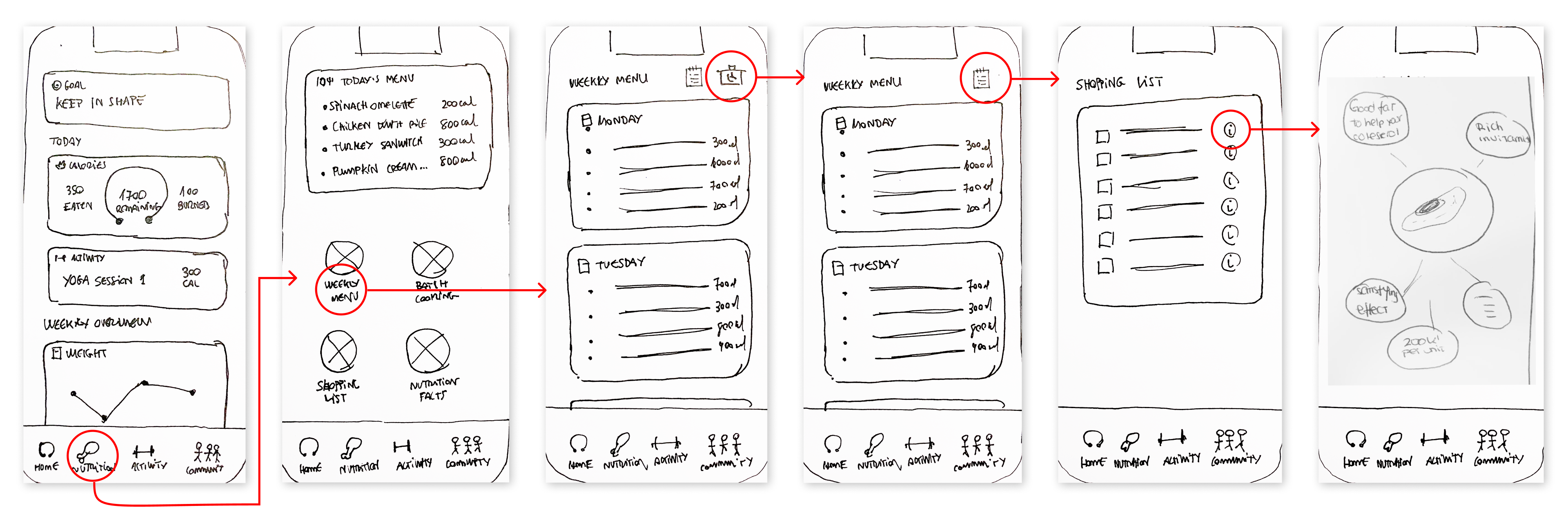
We did five interviews to test the sketches to validate the idea and put the product in front of users to get feedback quickly. We used Marvel to prototype the screens.
Overall, we got excellent feedback, especially on these points:
Anyway, we also got pretty good insights to improve the product. These are some changes we applied to the wireframes with the feedback gathered during the concept testing:
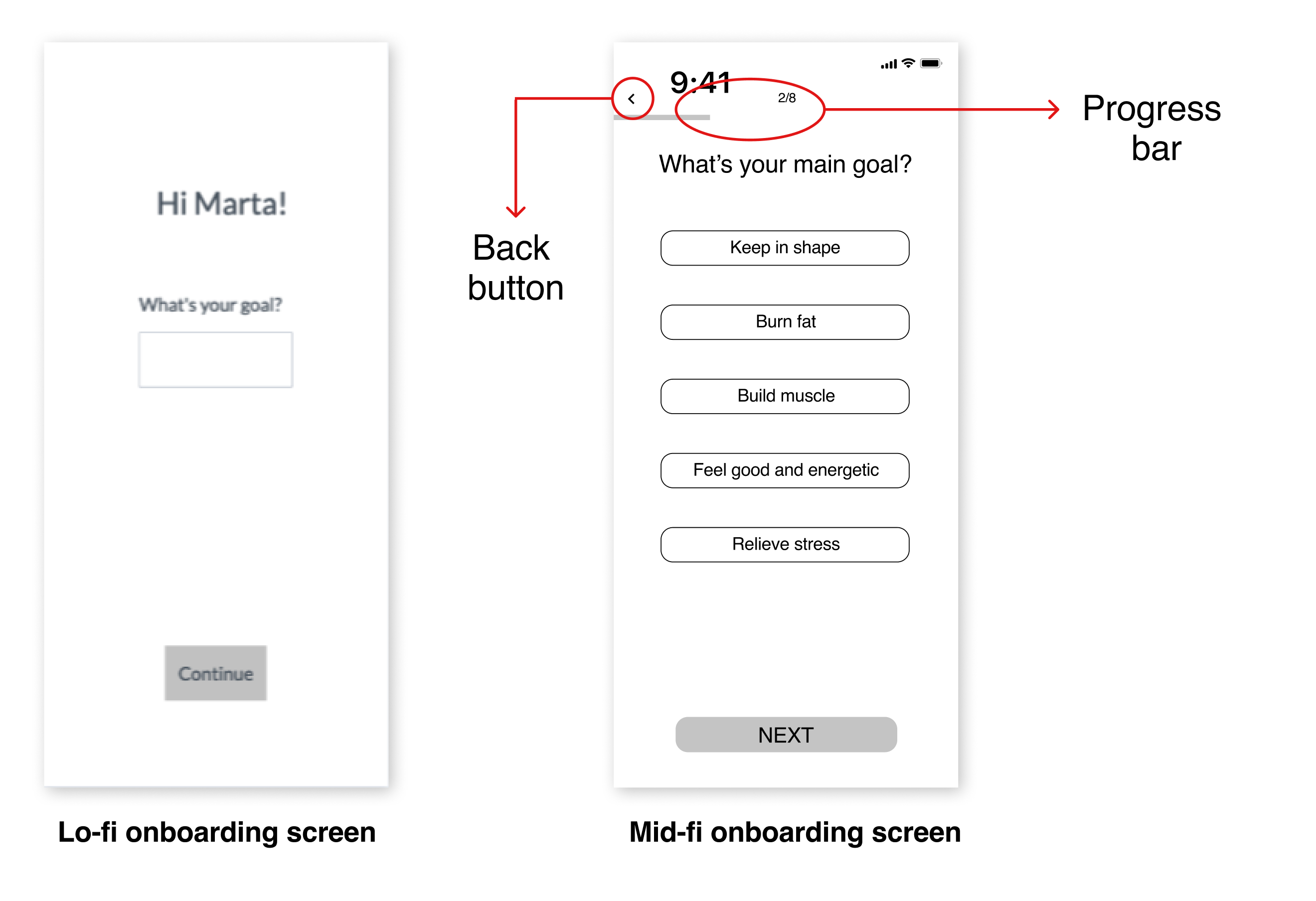
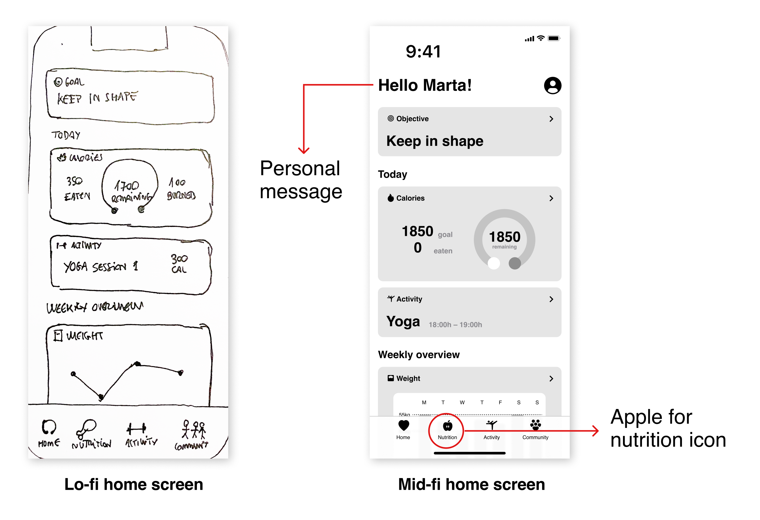
Once we finished the concept testing interviews and gathered the feedback, we built the wireframes.
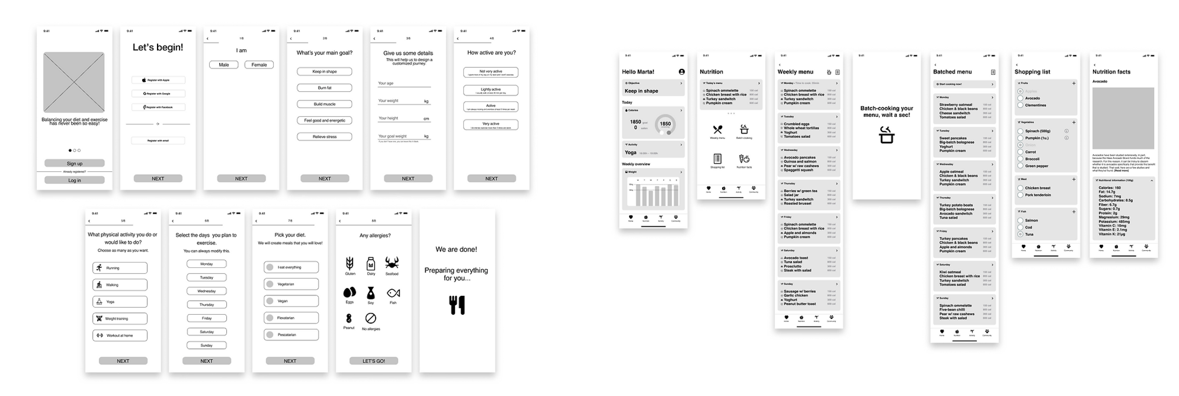
We conducted usability testing sessions with 5 users and got feedback from 11 users testing the wireframes remotely with Maze.
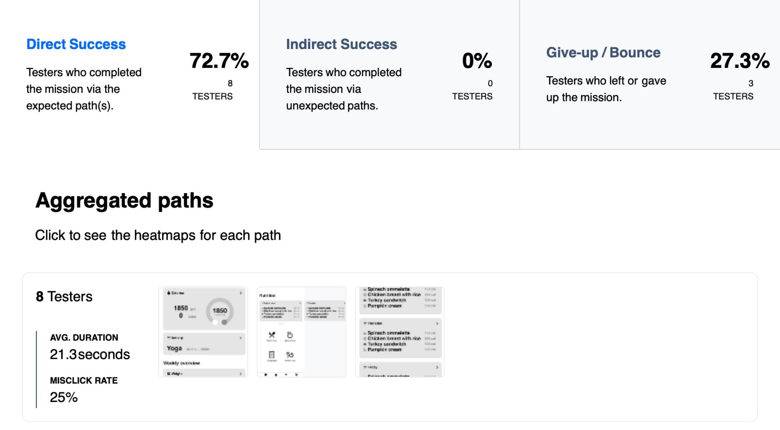
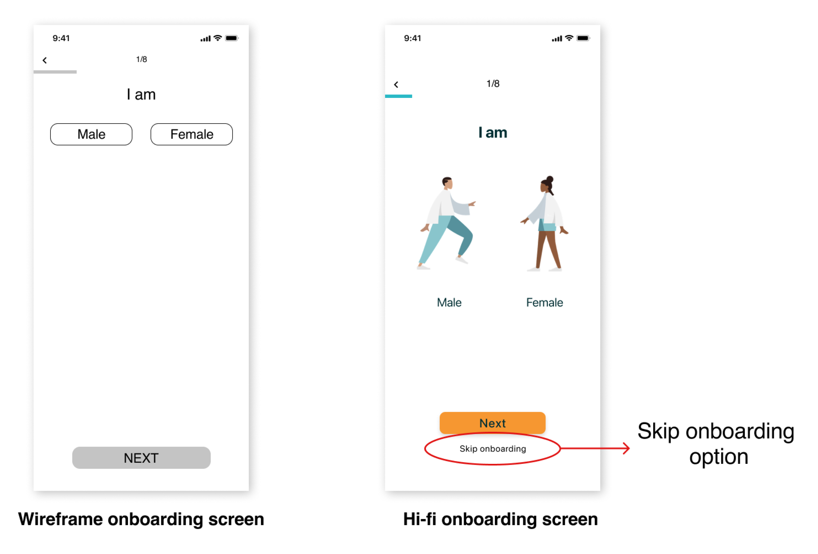
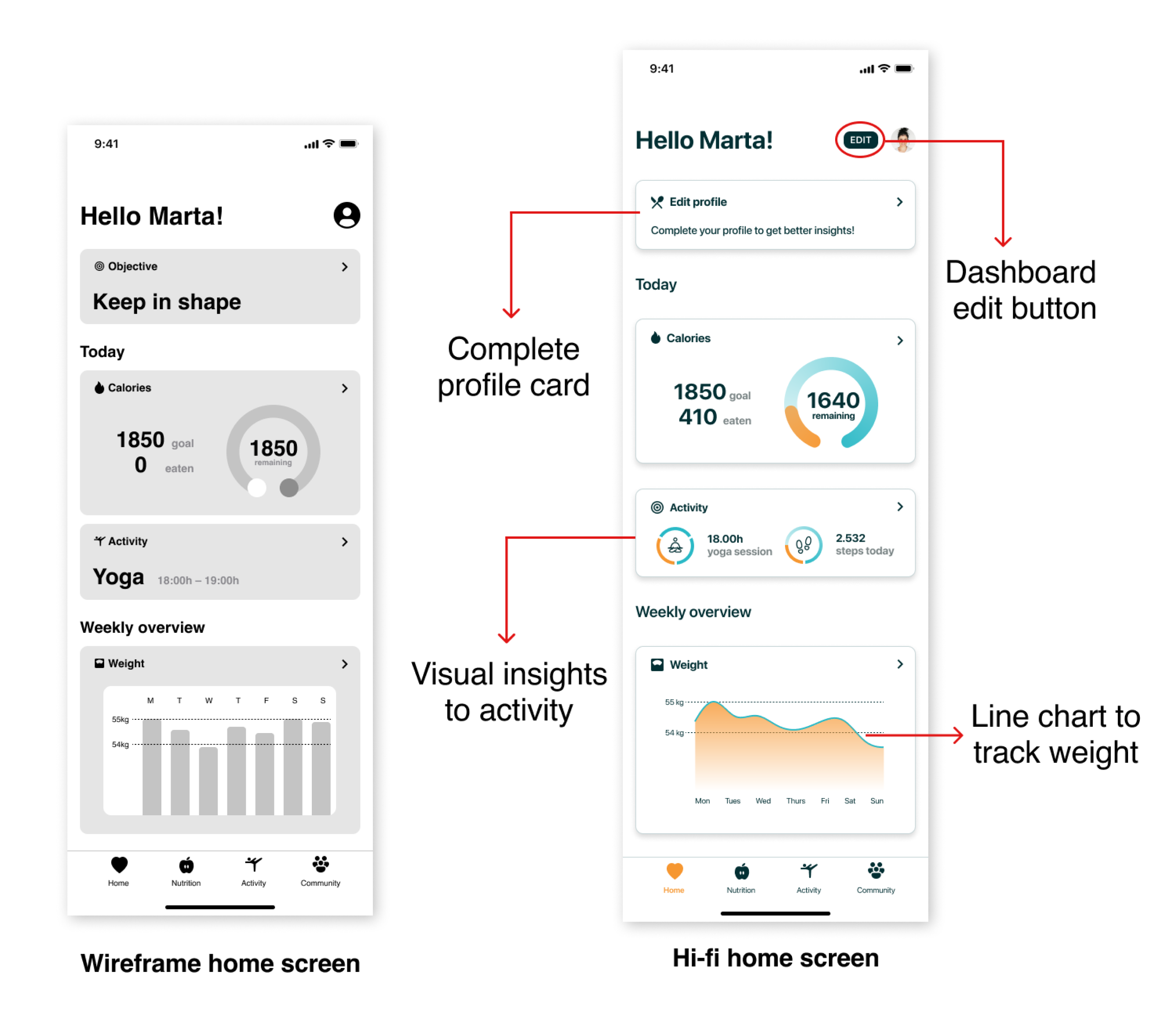
With all the feedback gathered during the usability tests, we decided to apply these changes to the hi-fi prototype to improve its usability:
We did a visual competitive analysis with the five apps spotted during the market research stage. With that exercise, we were able to identify the current identities used in the wellness app market and understand what our users may expect. We can also make our product identity look different from what’s already there with this information.

As we can see in the image, despite Fitia and Myfitnesspal’s colors being very distant from the color wheel, they keep a monochromatic harmony with one solid hue and three neutral colors. So here, we saw an opportunity to differentiate from the competitors using a complementary harmony (orange and blue), avoiding the risks of picking too many colors
To define our brand personality, we choose five adjectives to identify the character and personality traits of the brand:
Based on these adjectives, we decided to choose EatsyPeasy as a brand name. For us, it sounded optimistic, friendly, funny, and fitted perfectly with our brand attributes.
Then, based on the brand attributes, we created a mood board aligned with the style and concept of EatsyPeasy. We used complementary and vibrant colors to convey optimism.
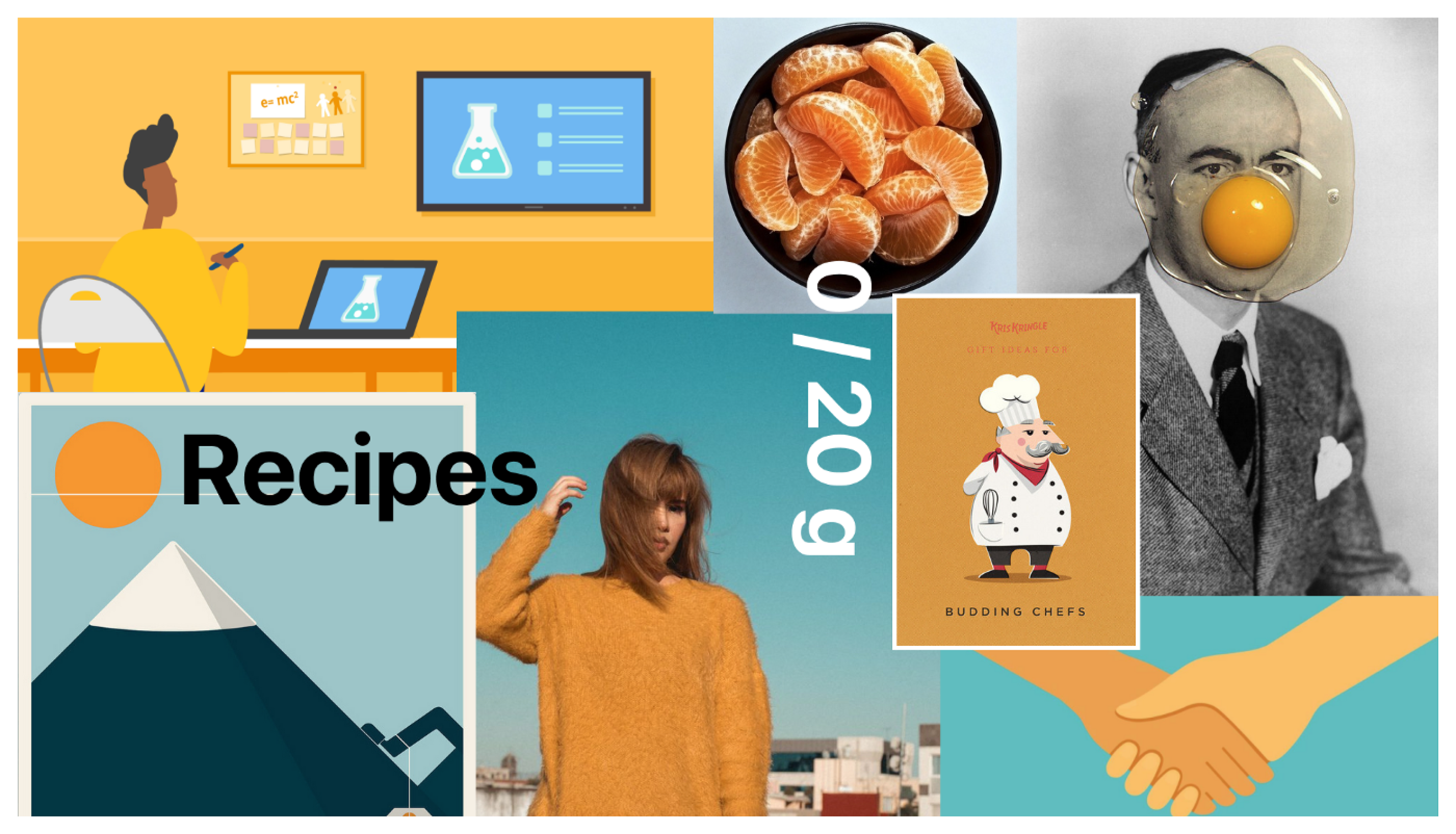
With the mood board ready, we tested it with fourteen people. These are the most used words with they defined the mood board: collaboration, fresh, warmth, educational, smart, and scientific.
Finally, we were ready to move on.
To communicate the essence of a visual brand, we decided to create the style tile. With that, we can focus on the individual component details while capturing elements of the overall look and feel.
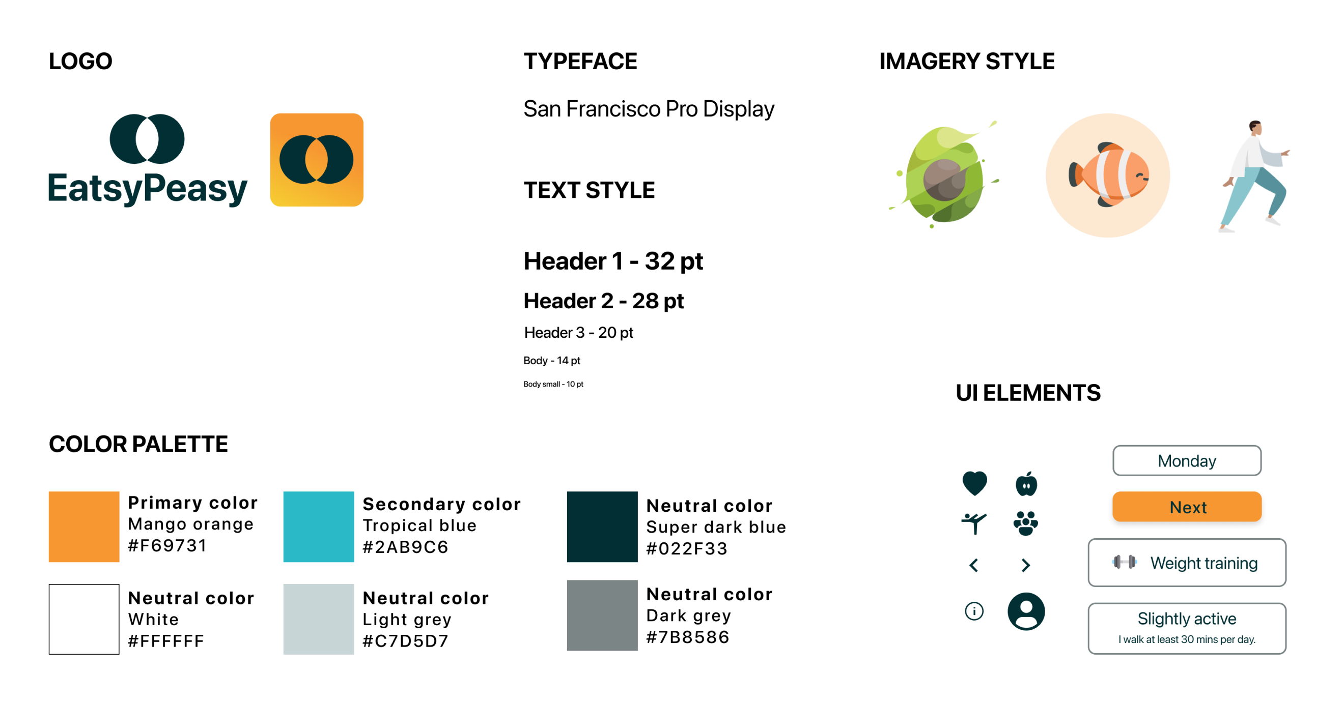
Once we finished the look and feel of EatsyPeasy, we designed the interactive hi-fi prototype for an iPhone 13 screen with animations and micro-interactions that you can test on Figma by clicking here.
Here’s a short video of the hi-hi prototype that shows Marta’s happy path to complete the onboarding, check the weekly menu, and read nutritional facts of the avocado:
We wanted to create small but impactful moments to enhance the usability of our product and improve its adoption. In the following gif, there are some microinteractions and animations that we added to humanize the conversation between EatsyPeasy and Marta.
That was our first project approaching a full-design process with a broad scope. So, this four-week sprint was very challenging and worthwhile for us.
In the beginning, we invested a lot of time thinking about all the app’s features, which was a little bit time-consuming. When you face this kind of broad project, you have to focus on the MVP and not try to solve all the issues simultaneously.
To wrap up, I want to highlight the following conclusions:
If you need to get in touch or just say hi!