
How can we discover music on Spotify? Of course, the platform offers playlists, recommendations, suggestions, and new albums notifications. But have you ever tried to look for new bands? How was your experience?
Besides that, each city brings you different vibes. Think in Nashville. What genre first comes into your head? Maybe country? Think in Barcelona or maybe New York? What artists come into your mind?
Let me introduce you Local Scene feature for Spotify. This new feature will allow users to discover artists nearby or in different locations filtering by genre.
I decided to design the feature on the iOS platform because I am very used to the iOS Design system. Therefore, the frames used for the design are from an iPhone 13.
This feature first came to my mind responding to my specific needs. Yes, you guessed it! I'm a curious musician, and I'm constantly looking for emerging bands.
I decided to validate it quickly before moving on with the idea, applying a guerrilla research method. I interviewed five Spotify users between 20 and 40 years to understand if this feature made sense.
These are some of the insights that I took and classified in the affinity diagram:
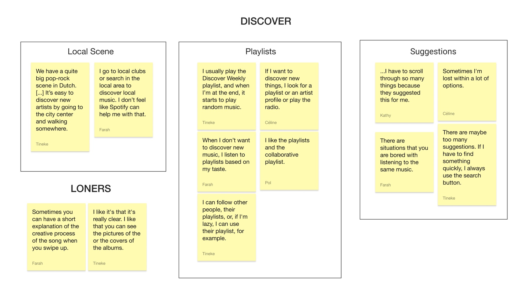
Relevant quotes:
“I go to local clubs or search in the local area to discover local music. I don’t feel like Spotify can help me with that.”
“There are situations that you are bored with listening to the same music.”
Main takeaways:
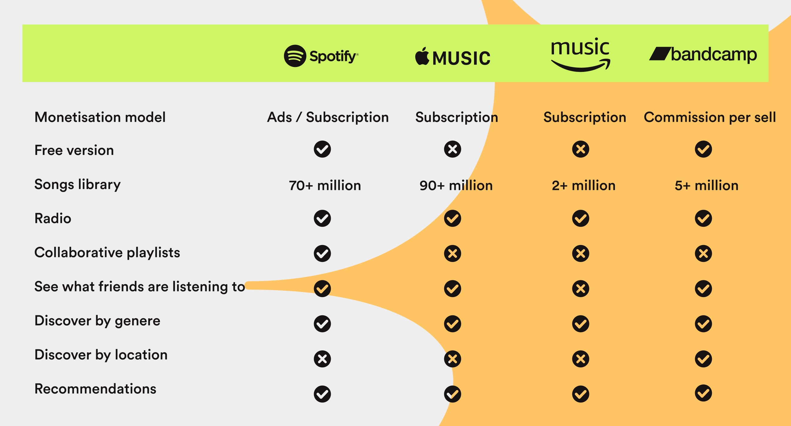
Although Spotify keeps leading the market, it has slightly decreased over the past years. Therefore, this scenario is an excellent opportunity to implement this feature to engage more users and recover the lost market share.
While doing market research, I realized that Bandcamp is the only competitor allowing to discover artists by location.
Before moving on with the design, I created Travis, my proto persona.
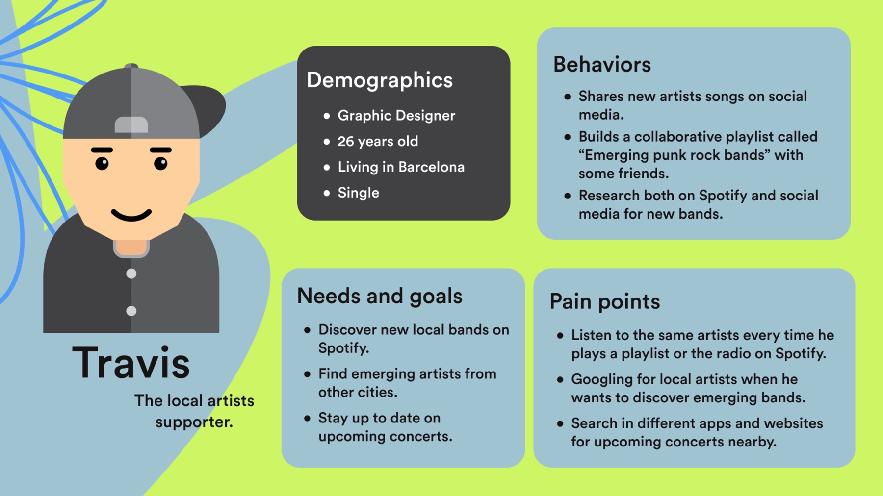
Travis is a local artists supporter and likes to discover new local bands and emerging artists from other cities. However, he is tired of listening to the same artists every time he plays a Spotify playlist.
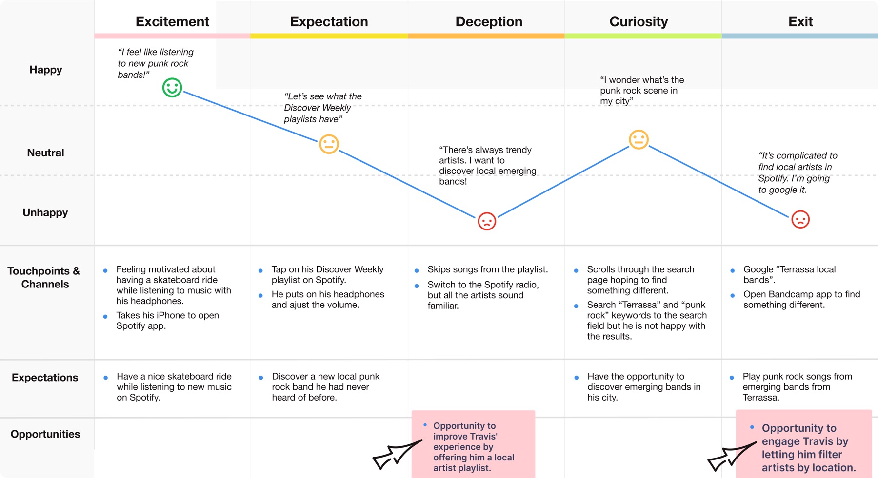
Travis wants to listen to new punk rock bands, but after playing the Discover Weekly playlist on Spotify, he realizes that there are always the same trendy artists.
He wonders if he could find emerging bands in Terrassa, where he lives. So he finally leaves Spotify to google for new bands.
Travis' journey brings us to the problem statement definition:
Spotify local scene was designed to achieve the discovery of emerging local artists.
We have observed that the playlists and radio are not meeting local music artists’ supporters’ expectations which is causing a loss of engagement of these users to Spotify business.
And the hypothesis statement:
We believe creating city filters for local artists’ supporters will achieve a higher retention rate. We will know we are right with the increase in the retention metrics.
We believe creating city filters for local artists’ supporters will achieve a higher retention rate. We will know we are right with the increase in the retention metrics.
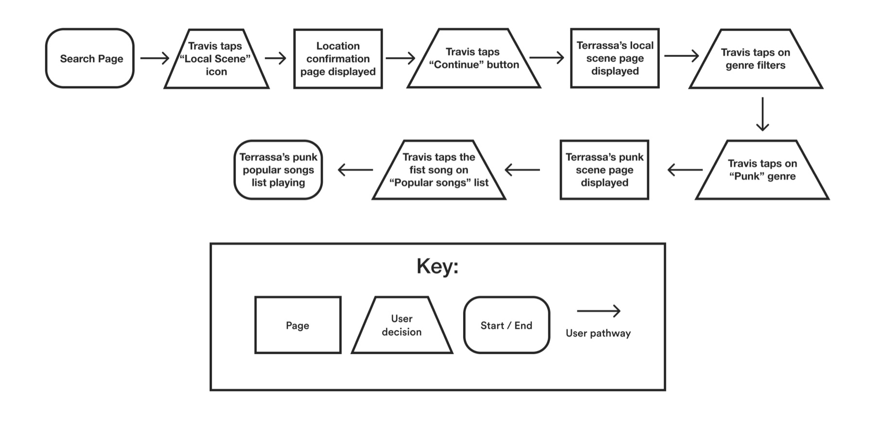
Travis is a local artists supporter and likes to discover new local bands and emerging artists from other cities. However, he is tired of listening to the same artists every time he plays a Spotify playlist.
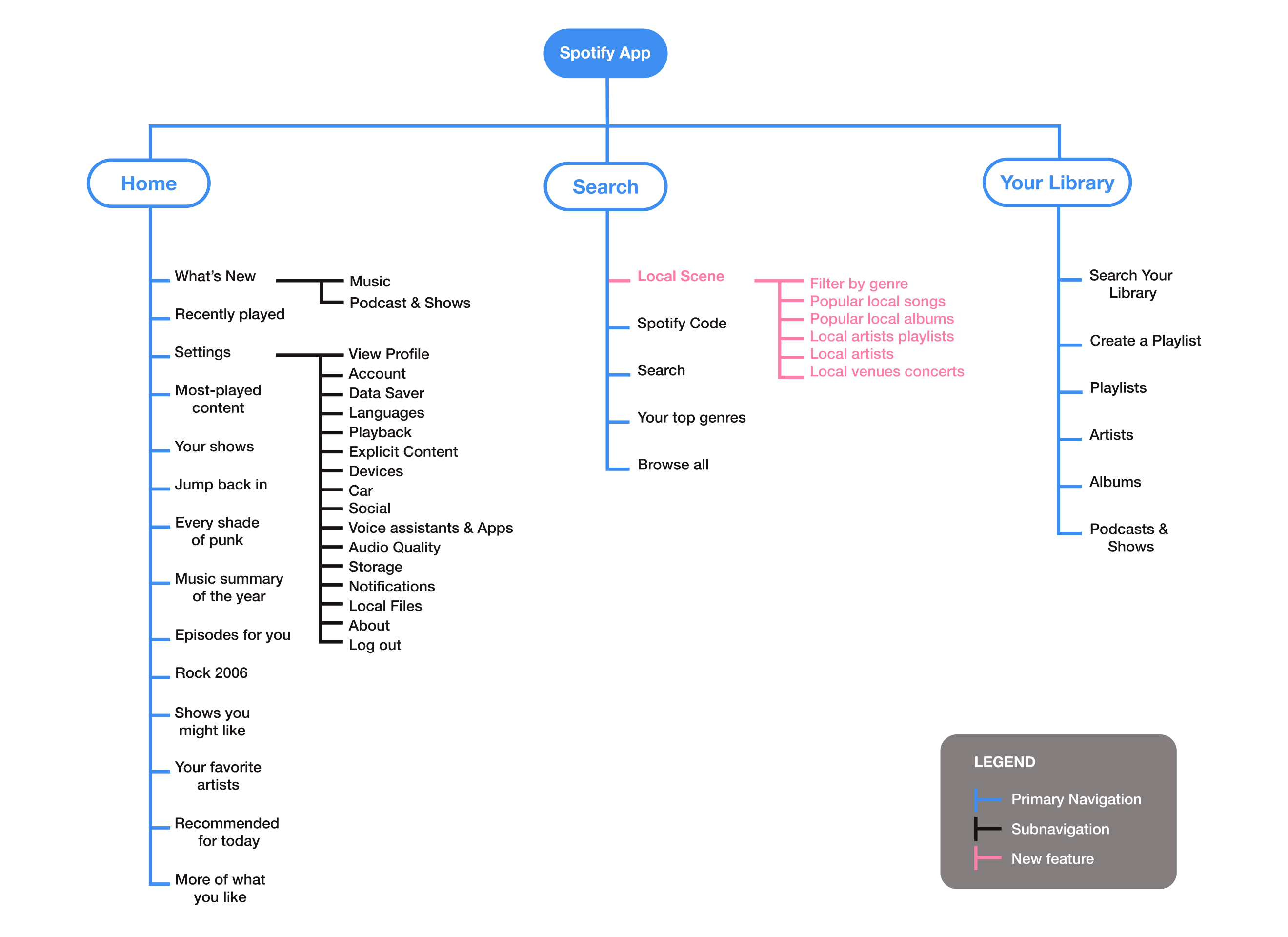
The user flow and site map helped me decide on the main screens to design. The below sketches show six key screens to complete the tasks.
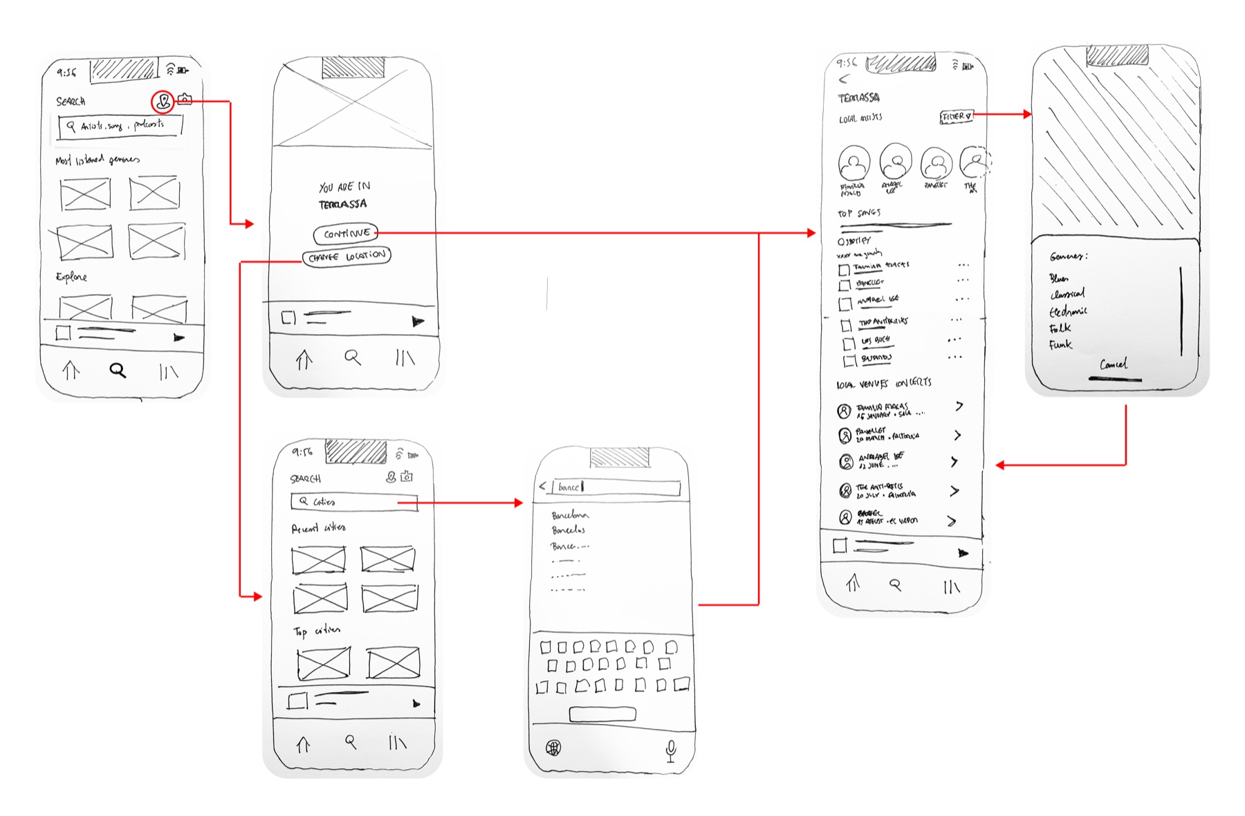
I tested the sketches with four users, gathering the following feedback:
"The Change Location button is misleading. Does it mean that maybe the location is wrong?"
"I don't see playlists. Don't the feature include playlists?"
With this feedback, I started working with the mid-fi prototype. First, I changed the "Change Location" button for "Discover other cities." Then, I added curated playlists in the Local Scene screen.
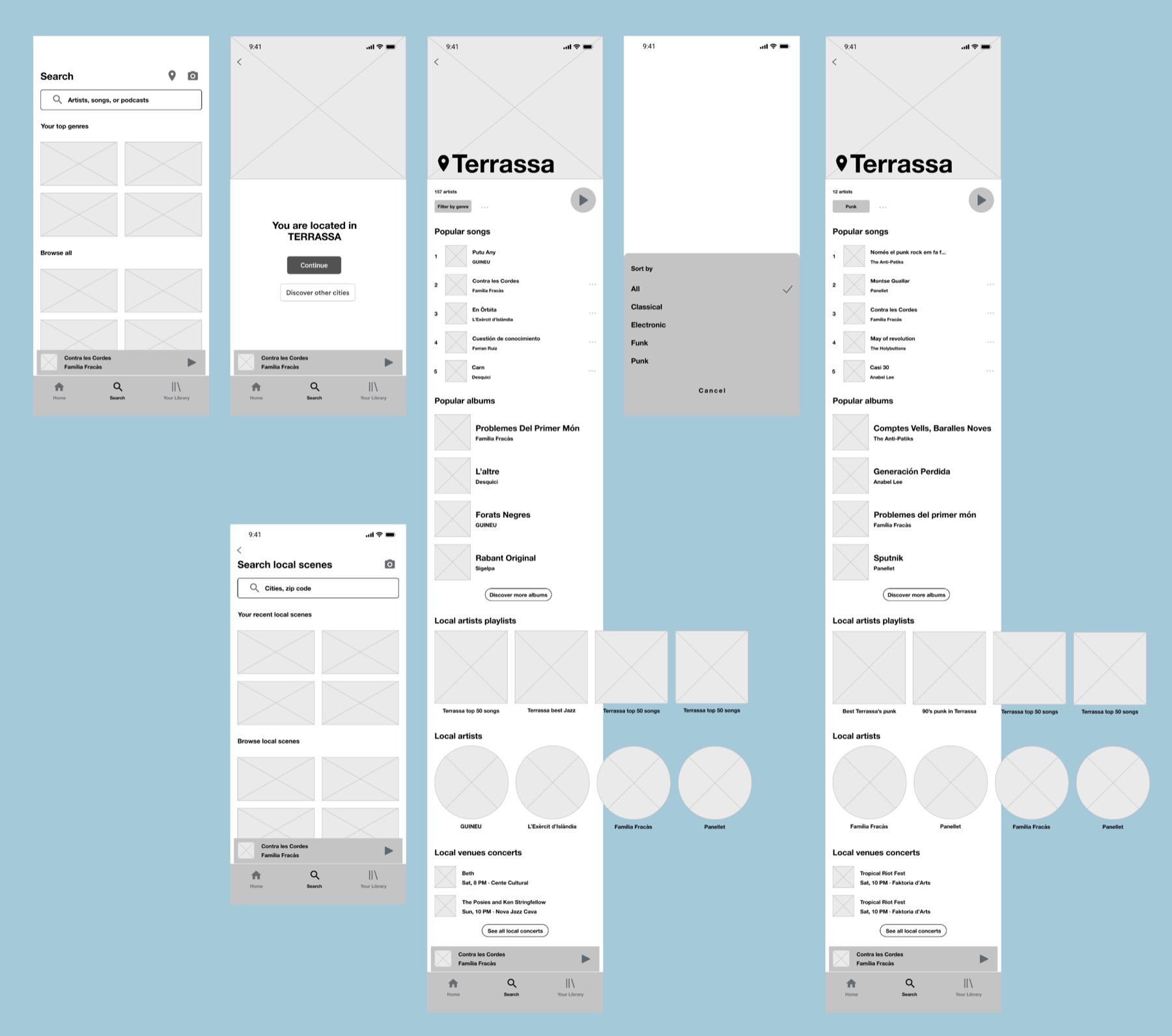
This conversion from sketches to wireframes made me rethink how I presented the information on the screen. For example, I gave more presence to the city name, added a background picture, and put the popular songs in the first place instead of the bands as Spotify is a streaming business.
After finishing the mid-fi prototype, I tested it with five users. Overall, the feedback was quite good, but I gathered a critical insight for the hi-fi design:
“It would be nice to know if the GPS is on. I don’t see anything informing that”
Once I created and tested the sketches and mid-fi prototype, I did the Atomic Design inventory for Spotify before moving on with the hi-fi prototype. Finally, I compiled the components and their variants on Figma to design faster.
Here we can see all the icons, buttons, typography, images, and colors of the Spotify app for iOS:
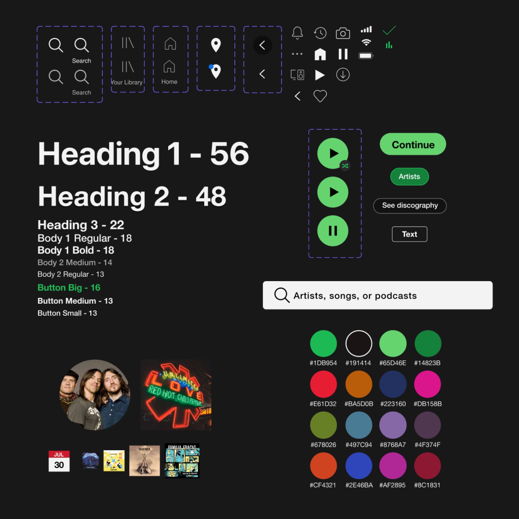
Spotify uses its typeface called Spotify Circular. Unfortunately, for copyright reasons, I had to use a fallback font. Researching the design guidelines, I decided to use Helvetica Neue, as Spotify recommends in the documentation.
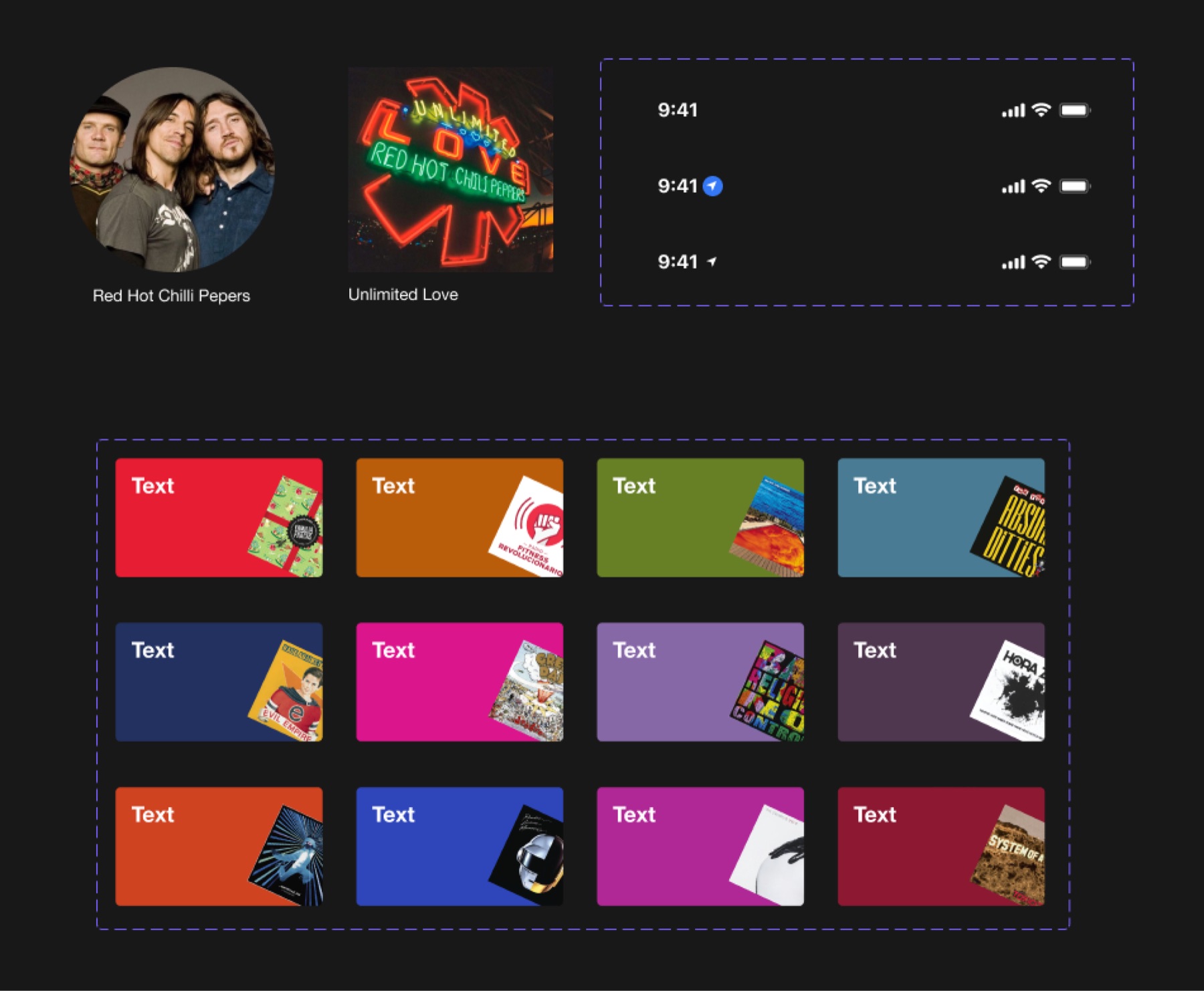
Combining these atoms, I could identify the molecules of the design. In addition, creating a card component with the twelve color variants helped me design the screens faster.
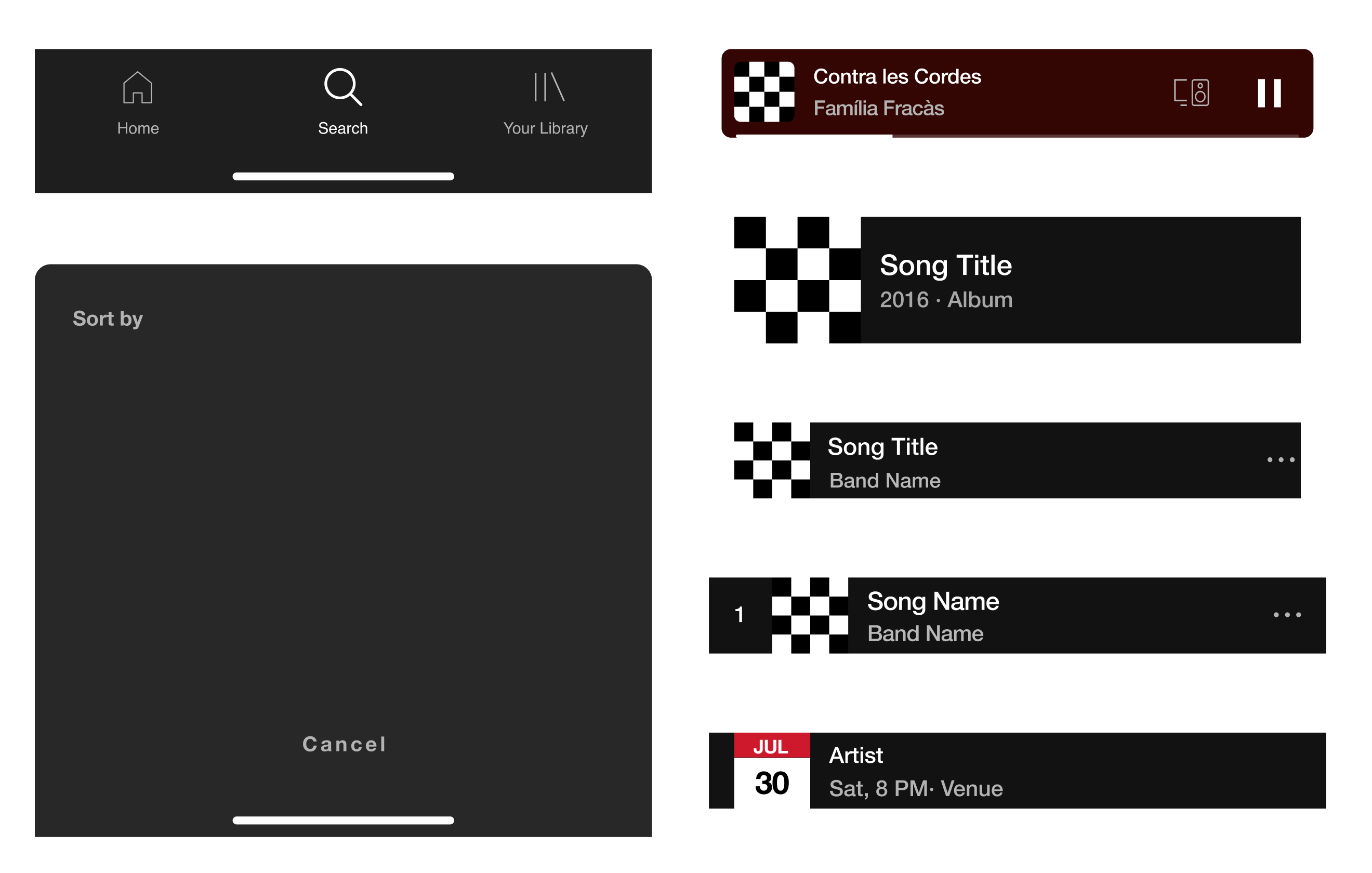
Here we can see the organisms of the design:
But let's get down to the business and try this incredible feature in the hi-fi prototype!
In this case, Travis wants to discover Punk artists, so he taps on the "Filter by genre" button.
But what happens if Travis wants to search for other cities? Let's move back to the search screen and click the local scene feature again.
So that's the Local Scene feature, a new way to discover music. 🎧
The first time this idea came to my head, it sounded good. However, until I didn't do some research and started sketching the screens on a piece of paper, I didn't realize the complexity of sorting out the ideas to make the feature helpful. Despite this, it's been quite a journey, and I couldn't be happier with the results!
The biggest challenge I faced with this UI challenge was dealing with a non-original font. That generated some font sizing inconsistencies, but I think I have solved it in the best possible way.
This three-week project has been crucial to master little by little some Figma tools like the components & variants creation and management. Once you've learned about creating components, creating and maintaining the design, it's easier.
If you need to get in touch or just say hi!