

Redesign the check-out restaurant experience and rethink the UI for Veond's native iOS app.
I shared this project with Silvia Vukic as a UX/UI Designer.
4 weeks part-time (during April 2022)
Veond is a vegan app marketplace led by Flor and Alex that brings special deals and offers for dining experiences, takeaways, workshops, and eco-friendly ethical products in just one place.
Vend's mission is to end animal exploitation making accessible and interesting the ordinary shopping for vegan goods, foods, and services to everyone.
We met Flor and Alex via Zoom, and they gave us some background about the MVP launch in 2020 and how they changed their growth plan because of the pandemic.
To find a solution for this problem and develop a new check-out design, we followed the Design Thinking methodology.
We did an extensive feature competitive analysis to identify opportunities and threats in the current deals platforms market. We compared Veond with 10 direct and indirect competitors and 14 different features. This table shows a reduced version of the original comparison.
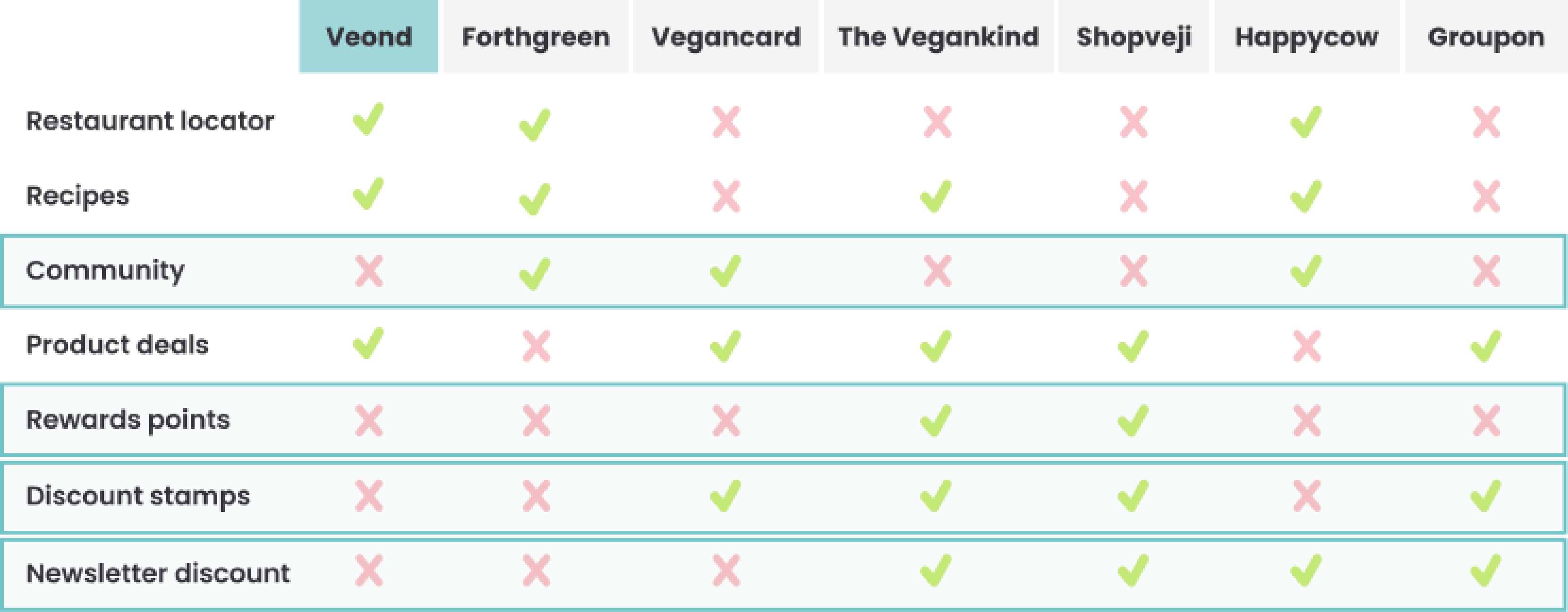
As we can see, direct competitors like Forthgreen or Groupon are offering features such as "community," "discounts stamps," or "newsletter discounts." In addition, ndirect competitors like The Vegankind or Shopveji offer a "reward points" feature.
We thought those are great opportunities that currently are not covered by Veond.
Knowing the state of the current market, we wanted to understand better the behavior of online consumers that look for products, restaurants, or experiences discounts.
We reviewed 6 different studies focused on human online purchasing behavior (
Invespcro |
MoEngage |
Capgemini|
Forbes |
Citeseerx |
Namogoo).
Some of the takeaways are:
After that, we conducted qualitative research interviewing 7 women based in big European cities. All these women are responsible consumers that buy online and use benefits like rewards, discounts, or coupons.
With the interviews, we discovered that:
Some relevant quotes gathered during the interview:
“Before going to a restaurant, I usually check for reviews” -Cristina, 31
“I subscribe to the newsletters to get an additional 10%-15% on purchases” -Lara, 26
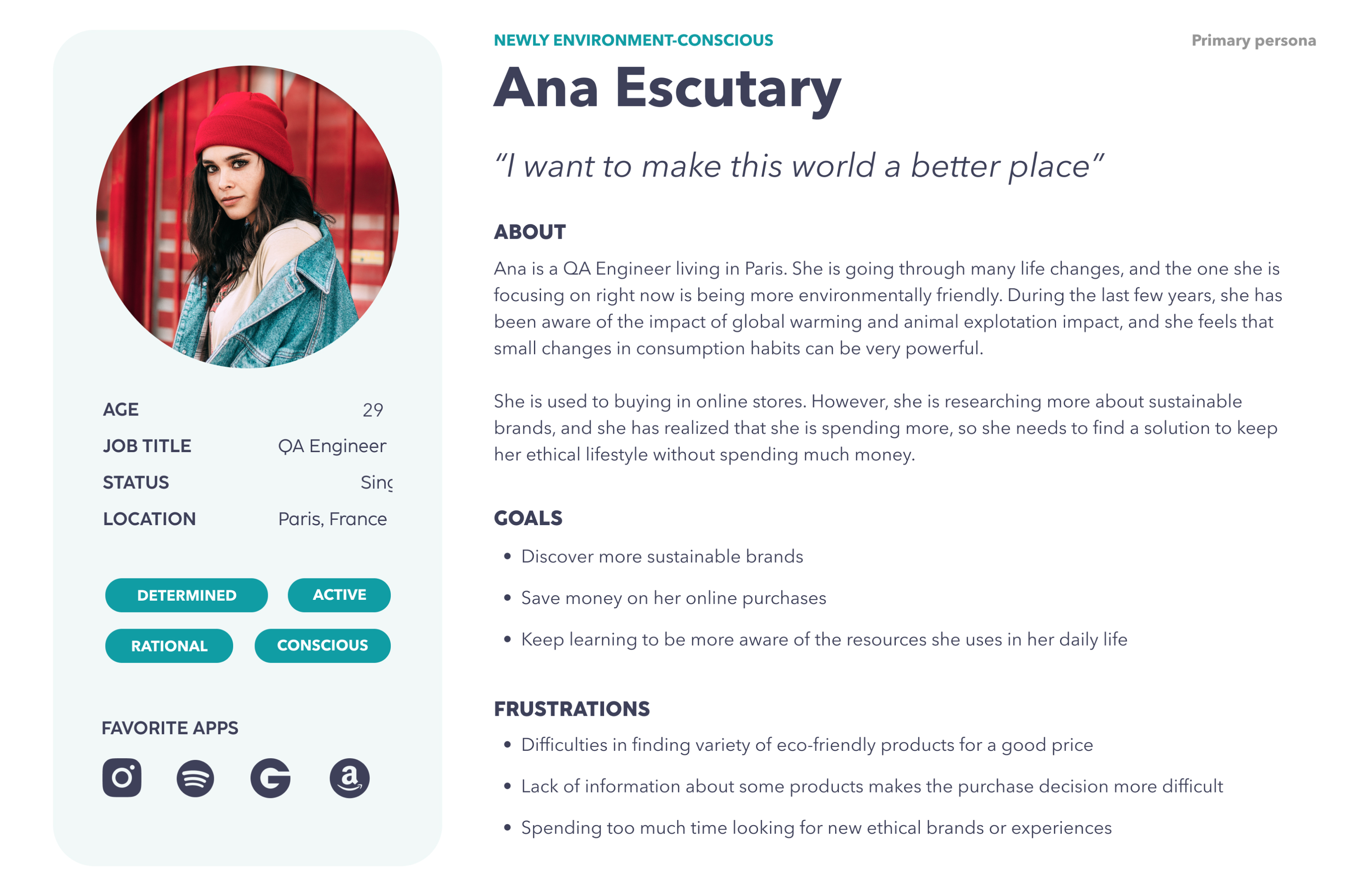
Ana is our primary User Persona. She focuses on being more environmentally friendly and wants to discover new sustainable brands while saving money.
She finds it challenging to discover vegan products for a reasonable price and spends too much time looking for new ethical brands. When she finds a product or a restaurant, she usually lacks information, making the purchase decision more difficult.
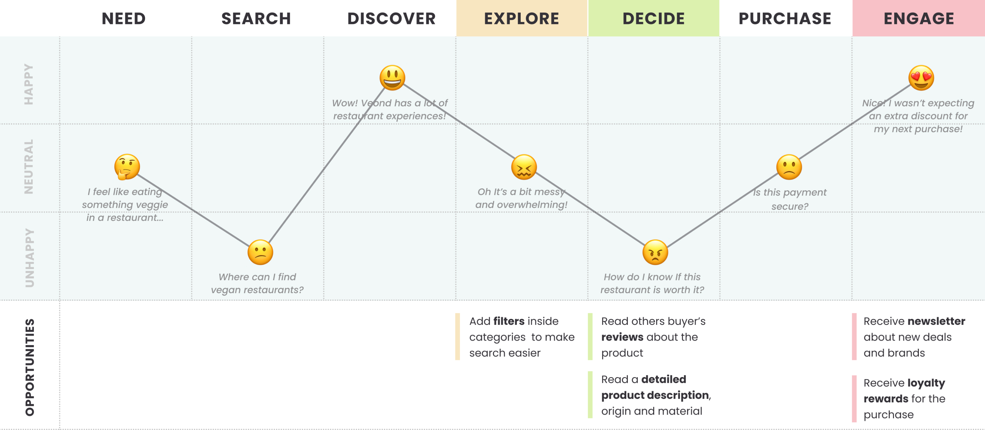
Looking at Ana's journey map when she buys a vegan product, we can see a significant low point in the decision stage. Here we spotted opportunities like offering her product reviews and a detailed product/experience description to make the decision easier.
In the explore stage, we can make her journey easier by offering filters inside each category and leverage the engagement stage by providing a newsletter with new deals or reward points for the purchase.
With all the gathered data, we defined the following problem statement.
Newly environment-conscious consumers need to find a way to get the right information about sustainable and ethical products because they want to make sure that it's worth the purchase.
And the hypothesis statement:
We believe that adding and organizing products/experiences information of Veond's app for environmentally-conscious consumers will increase user engagement and fidelity.
We will know we are right with higher user interaction and returning users increase.
Considering Ana's pain points, we defined three How Might We statements:

With the HMWs in mind, we brainstormed features. The Moscow Method allowed us to categorize what features are a must and optional for the check-out redesign.
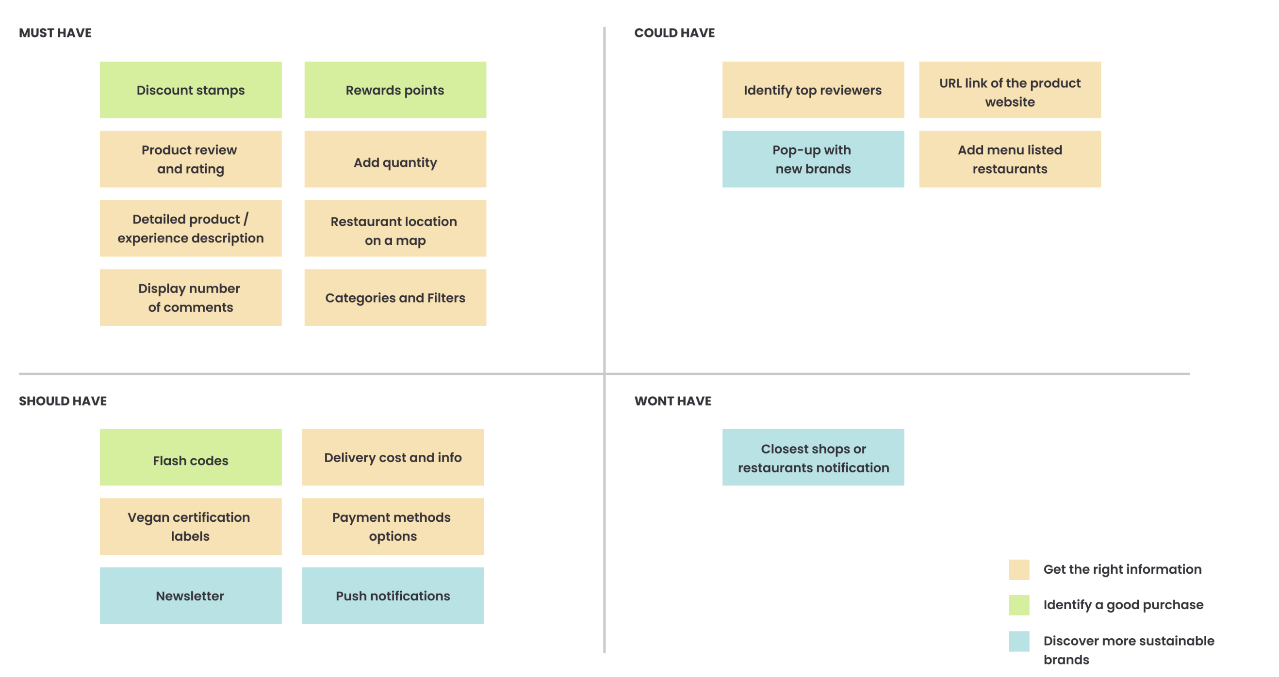
Bearing in mind Ana's needs, we decided to prioritize:
One of the opportunities presented in our User Journey was to help Ana discover new experiences and brands.
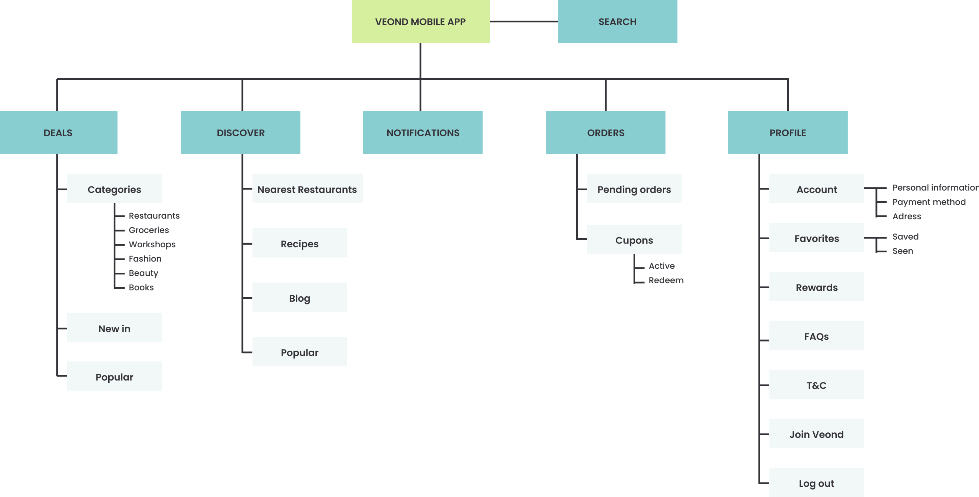
We rethought the Information Architecture of the app to enhance the discovering stage. That's why we created separate sections for Deals (where Ana can find coupons) and Discover (where Ana can find vegan restaurants, learn new recipes, or read the blog).
We created a new section called Notifications to help Ana discover further discounts and rethought the Check-out and Profile section.
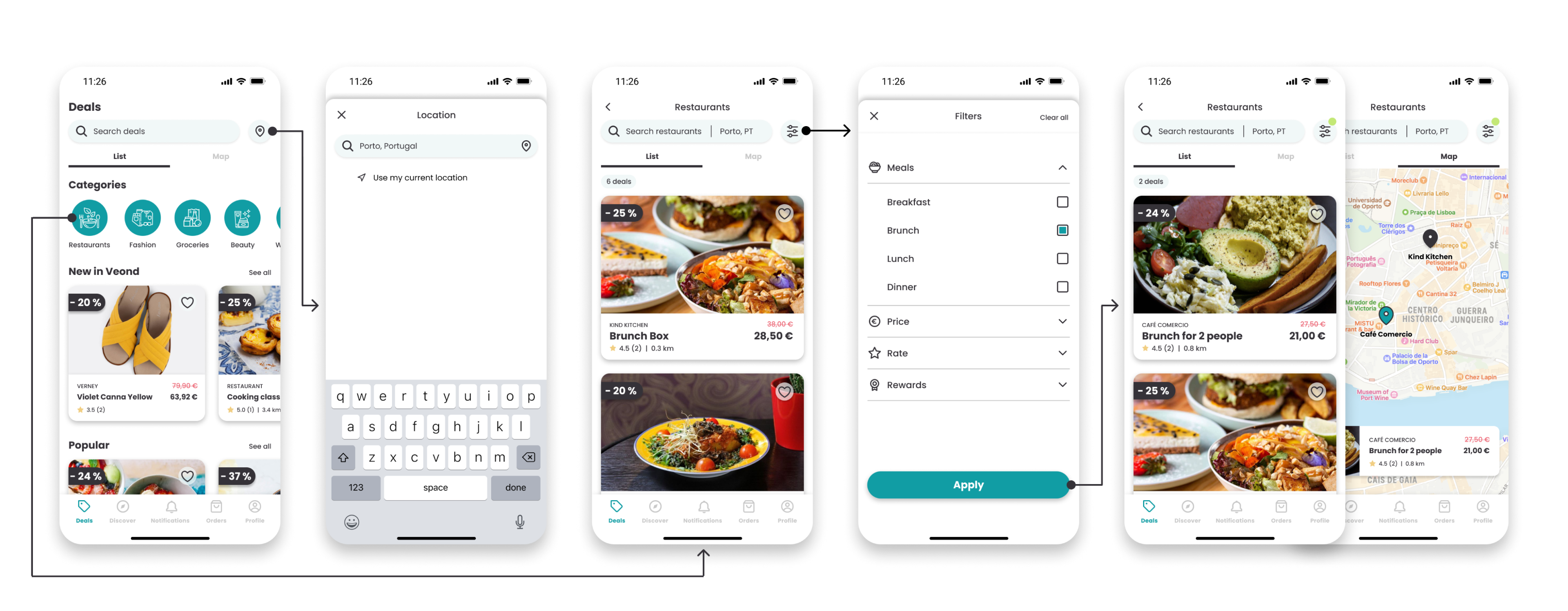
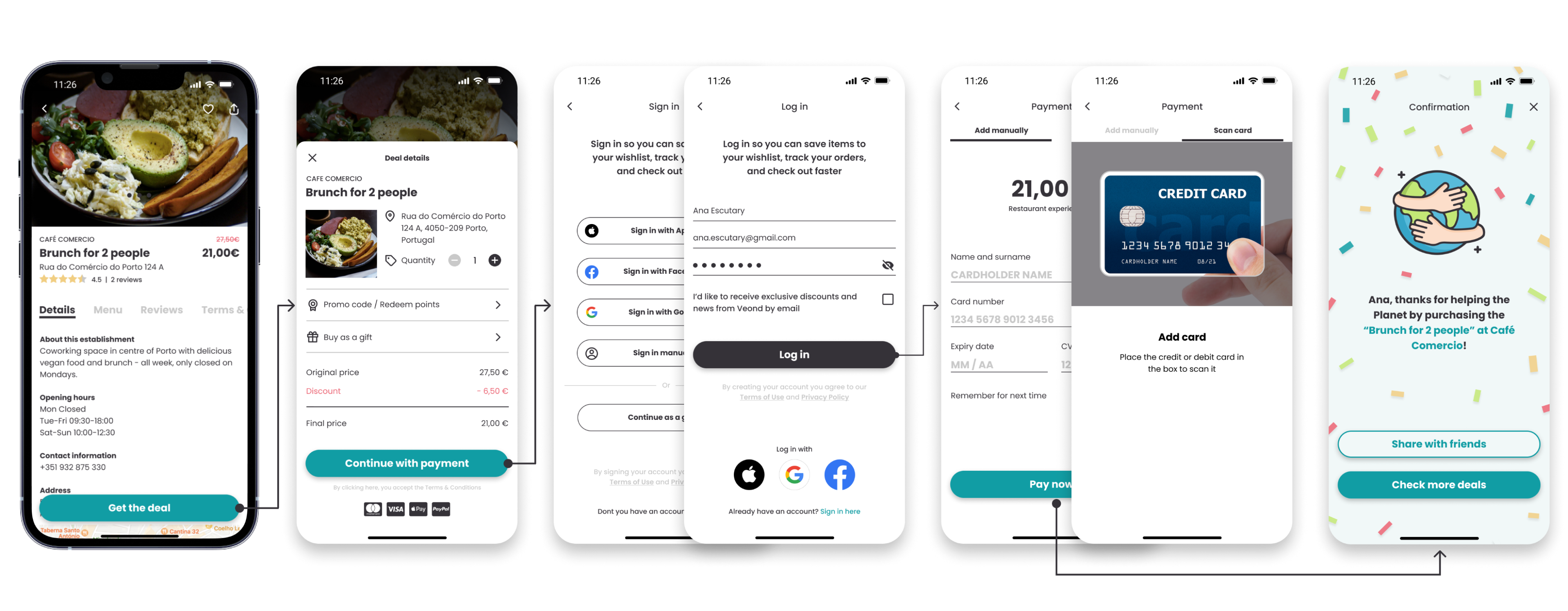
Then we ideated the check-out journey. Ana will buy a "Brunch for 2 people at Café Comercio" in the happy path.
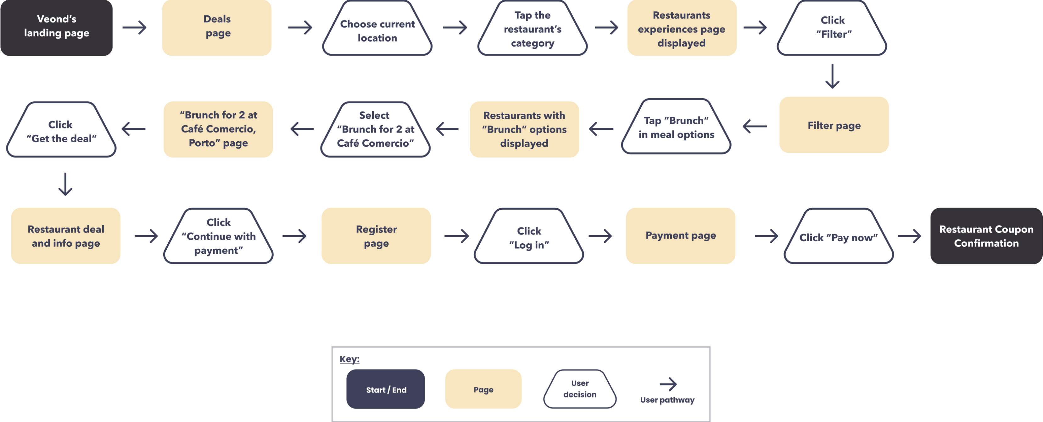
Once we defined the site map and user flow, we started putting our ideas together on paper and built the sketches.
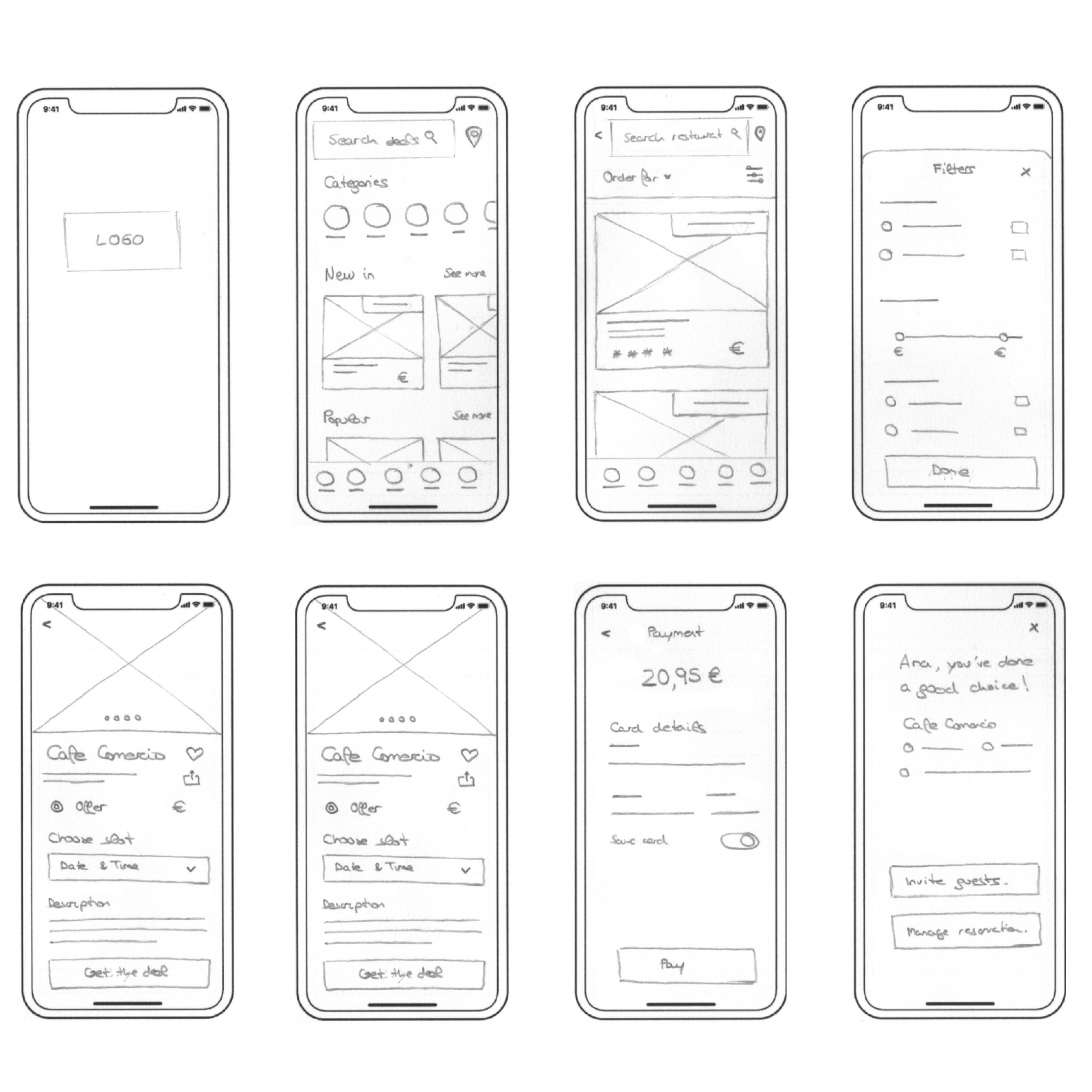
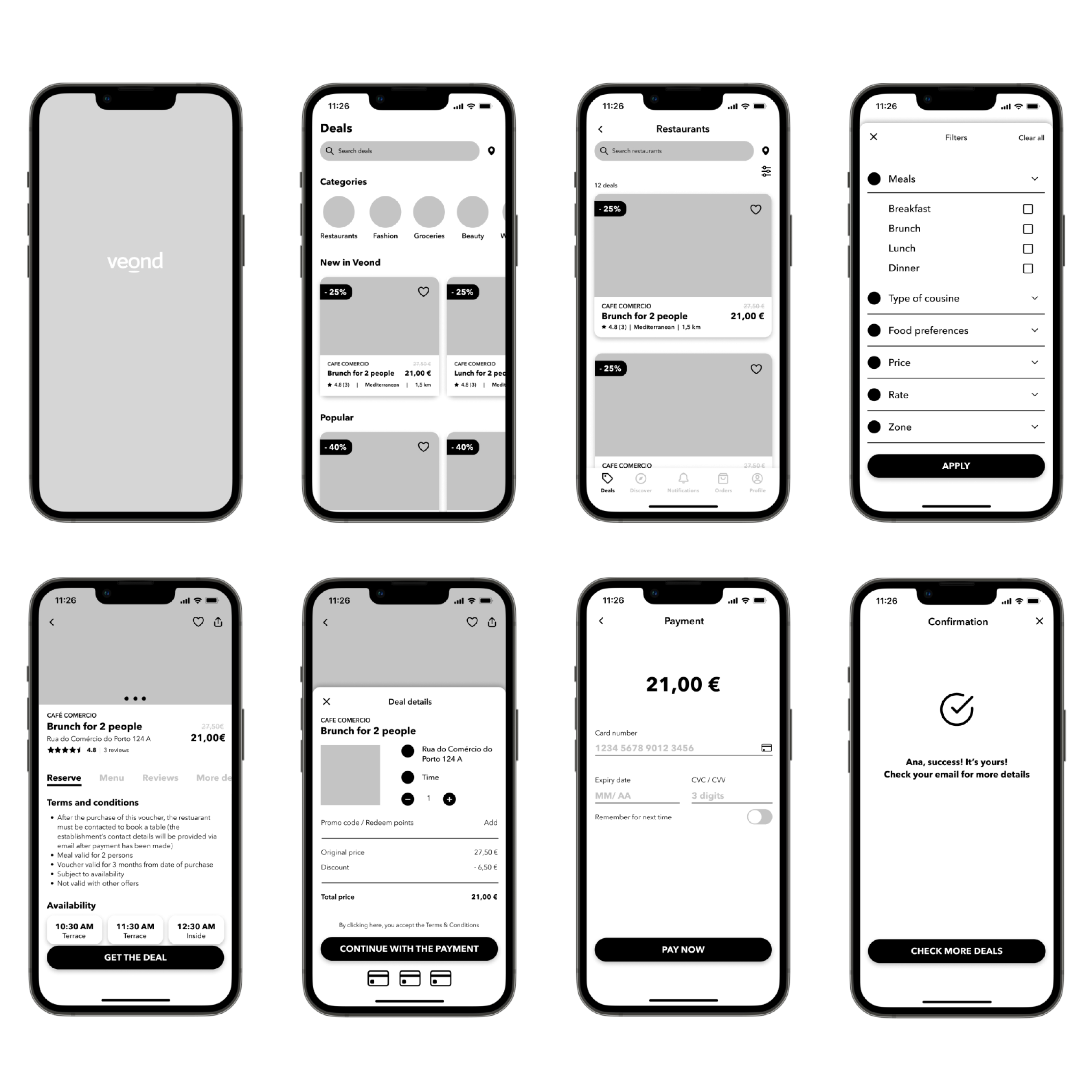
And then, the wireframes:
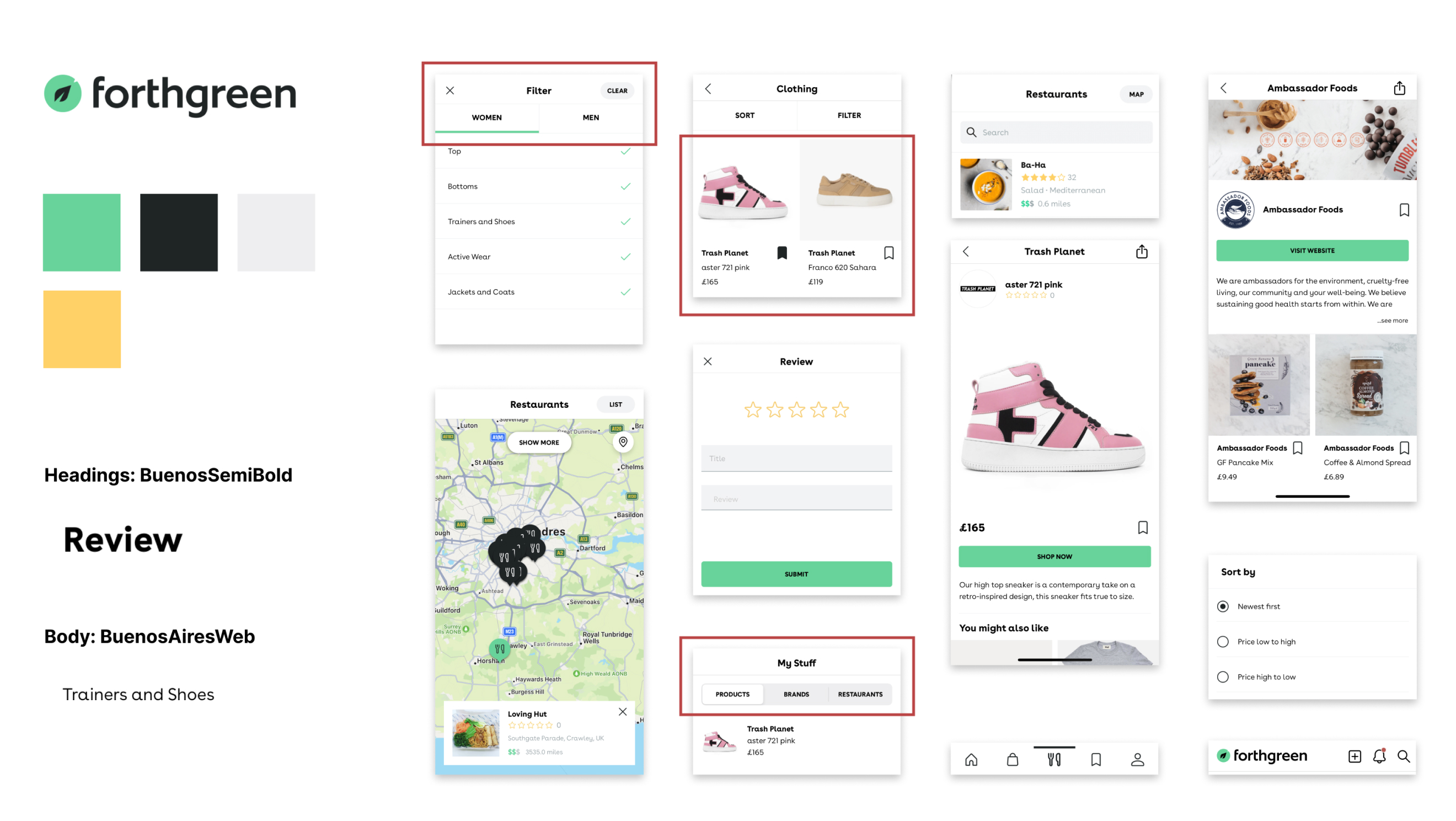
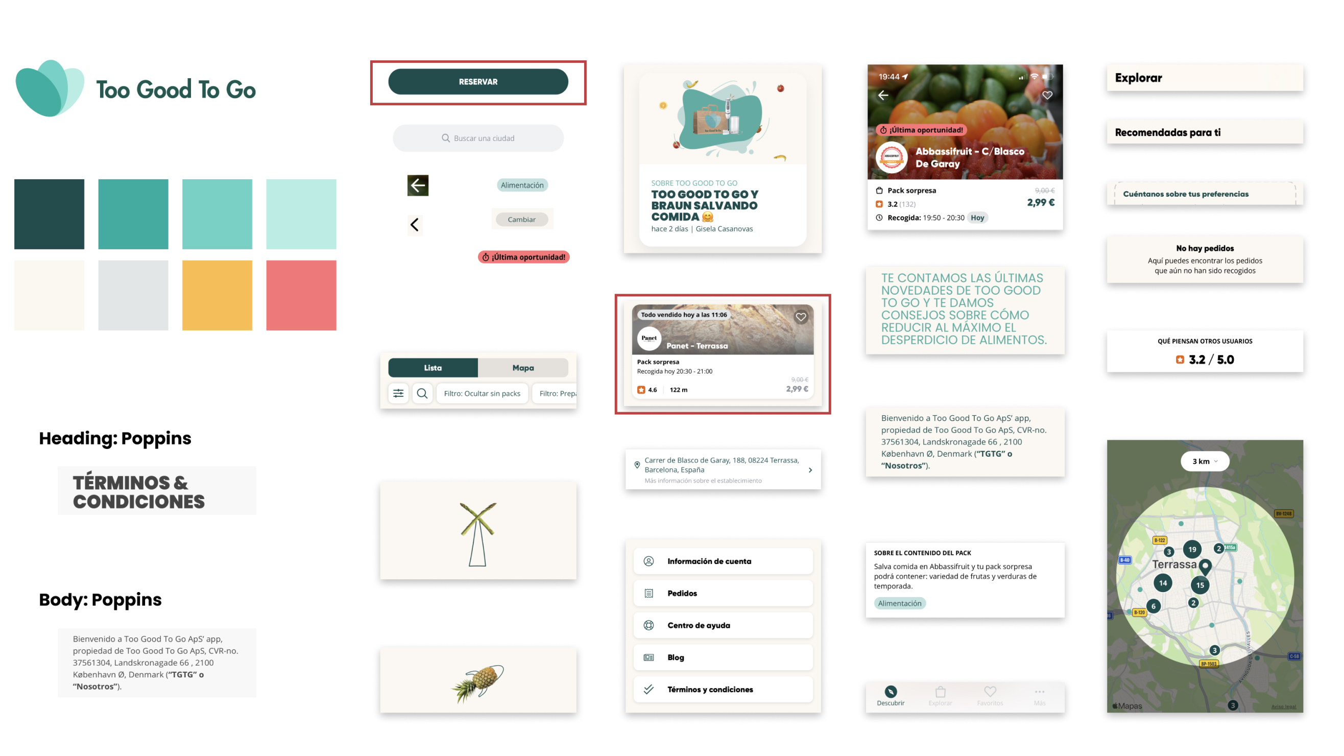
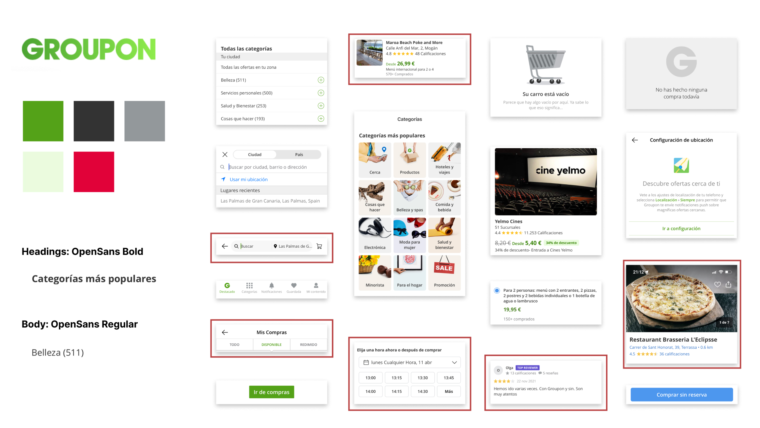
We did a visual competitive analysis with 3 apps from direct and indirect competitors that were a referent for our clients and us in terms of visuals and content. The research helped us identify the trends, layouts, colors, and typographies and know how to make Veond stand out.
So we highlighted what we liked the most from them to keep it as a reference.
These were Fothgreen, Too Good to Go, and Groupon.
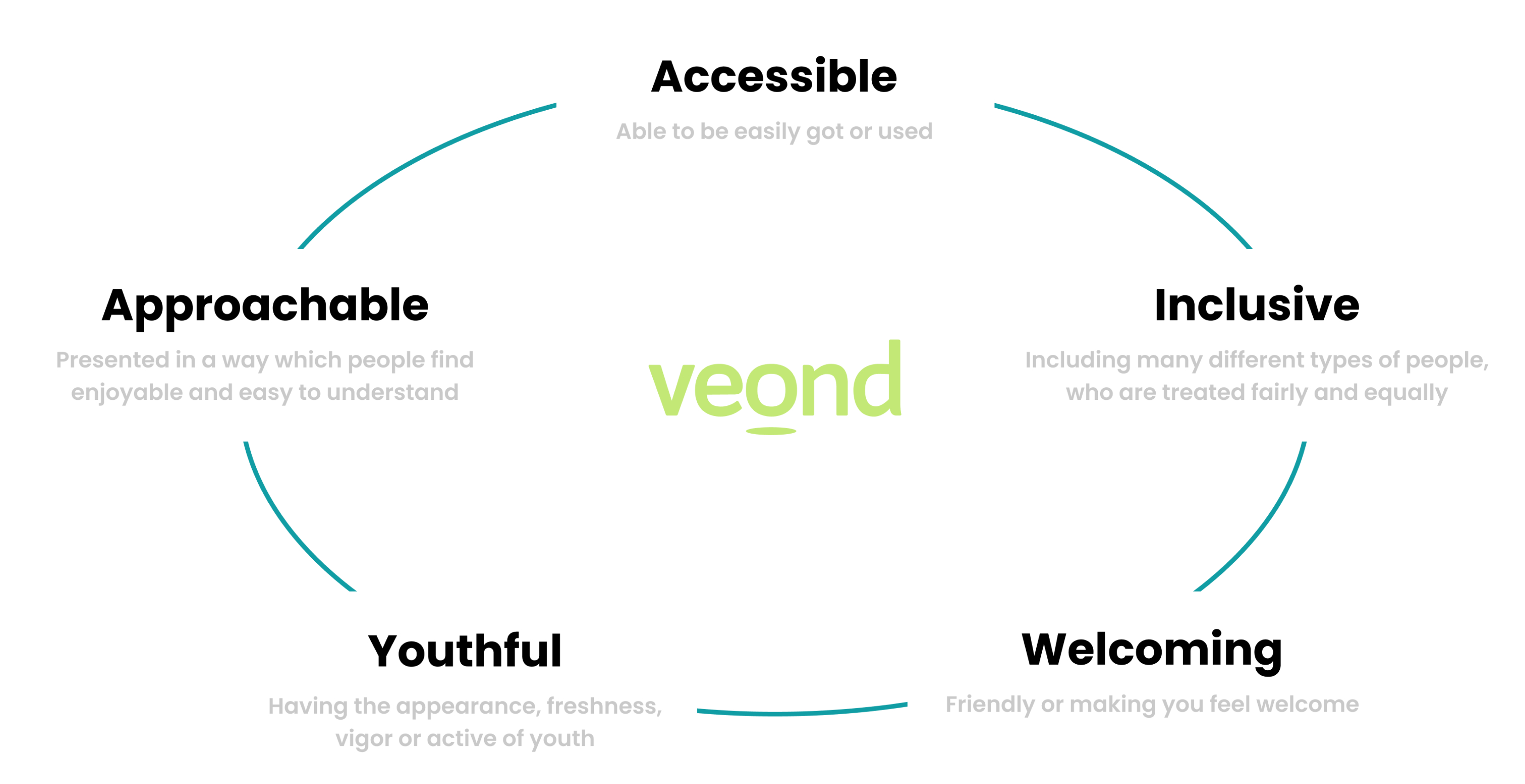
Veond has solid brand attributes, which we bared in mind throughout the whole process. These attributes are:
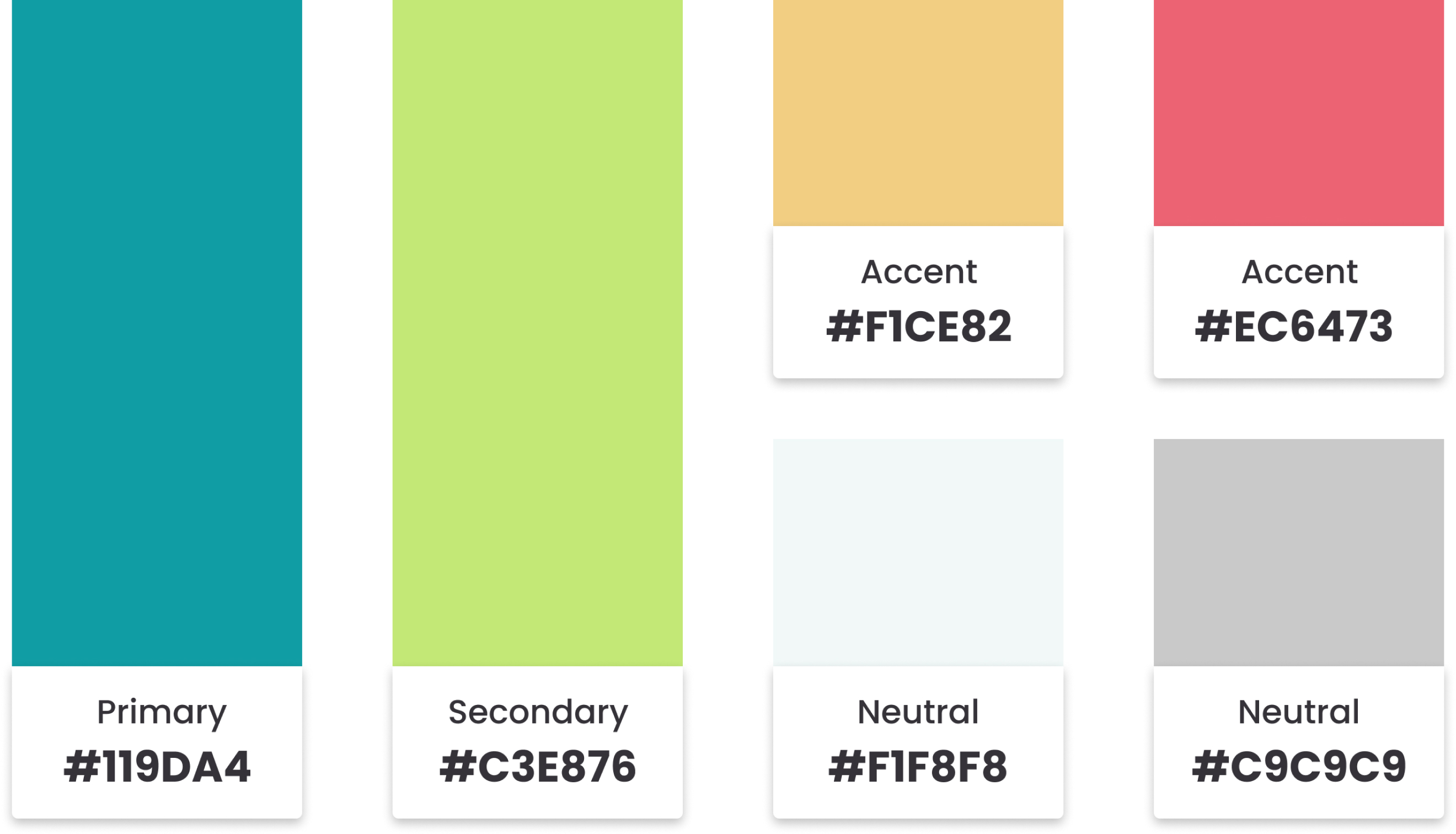
Before picking the new colors, we did a contrast test with the old Veond colors, and we realized the light green they used as a primary color has very low legibility.
So we proposed to our clients a color palette based on their attributes in which we tried to keep the essence of Veond but at the same time improve the accessibility, which was very important for them.
That's why we went for aquamarine as a primary color, we changed slightly the light green to match the complementary hues, and we kept it as a secondary color and then yellow and pink as an accent and light blue and grey as neutral.
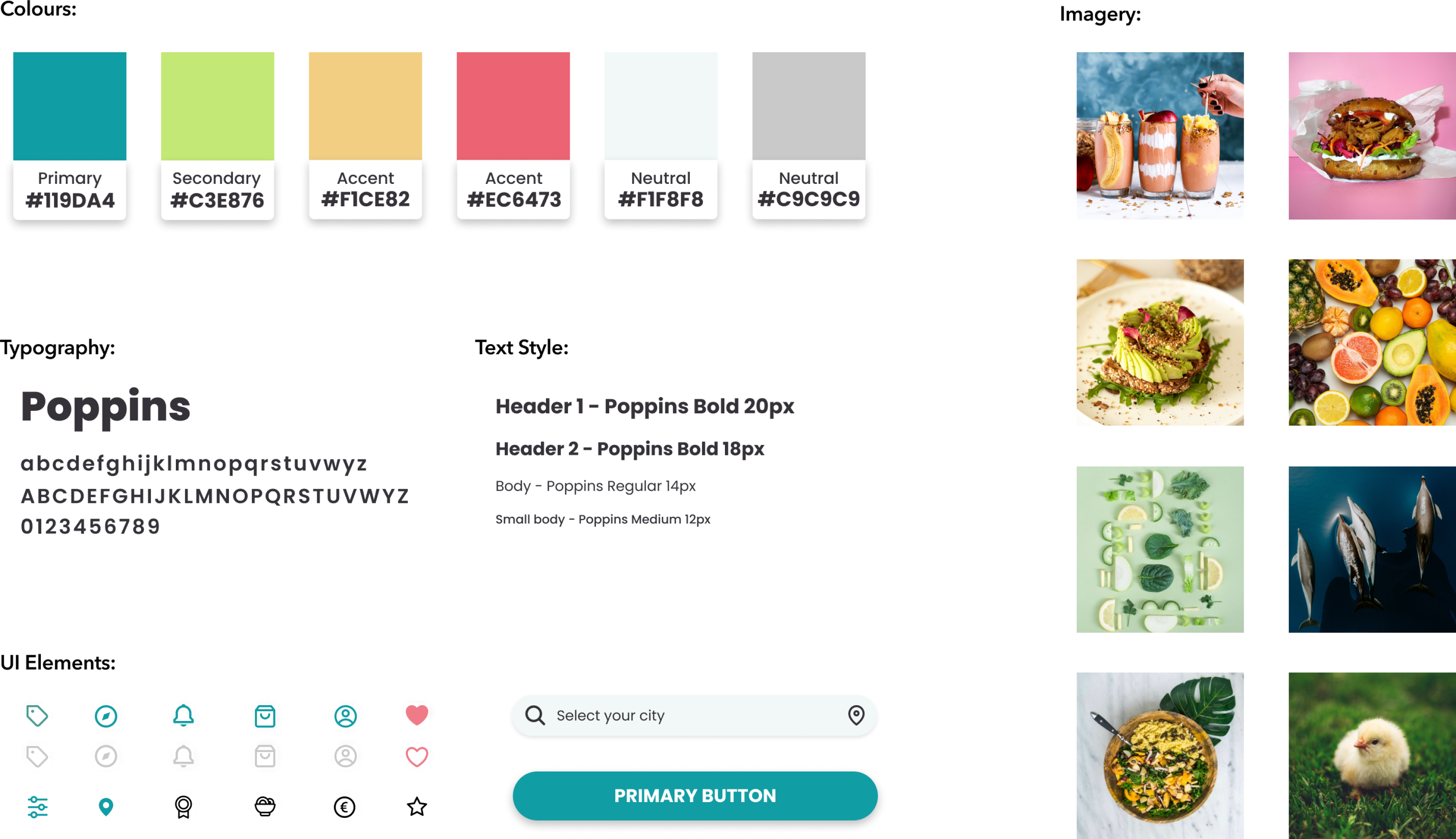
This style tile contains the main UI elements to keep a consistent brand strategy.
We chose a new font family called Poppins, a well-known geometric sans serif, because of its versatility and fresh look. We also included the Text Style, UI elements like icons and buttons, and imagery.
The images and typography are from a free source which is helpful for start-ups like Veond.
Keeping in mind users and our client feedback, we made some changes to the wireframes to improve the usability and refine our solution. The significant changes we made were in the payment and register screens.
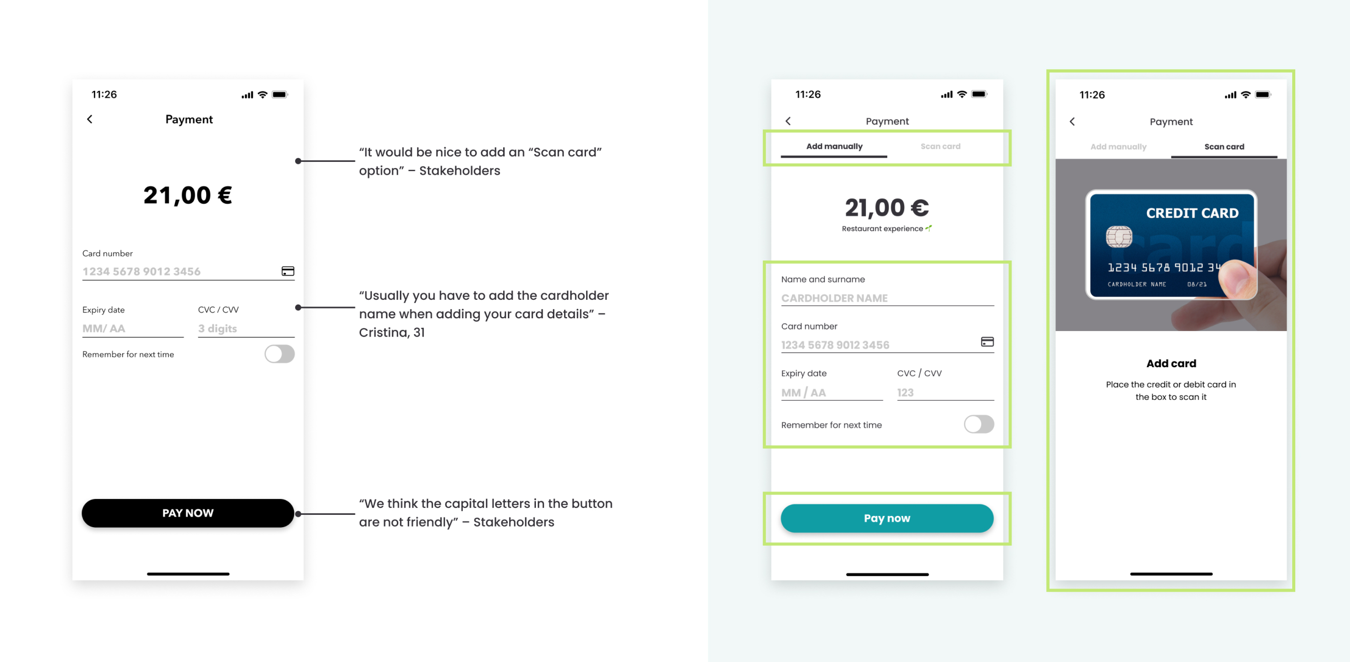
In the payment screen, we added the "Scan card" feature and a horizontal menu, and the cardholder name to the mandatory information that Ana has to fill in. On the other hand, we changed the buttons component to sentence case, improving the legibility.
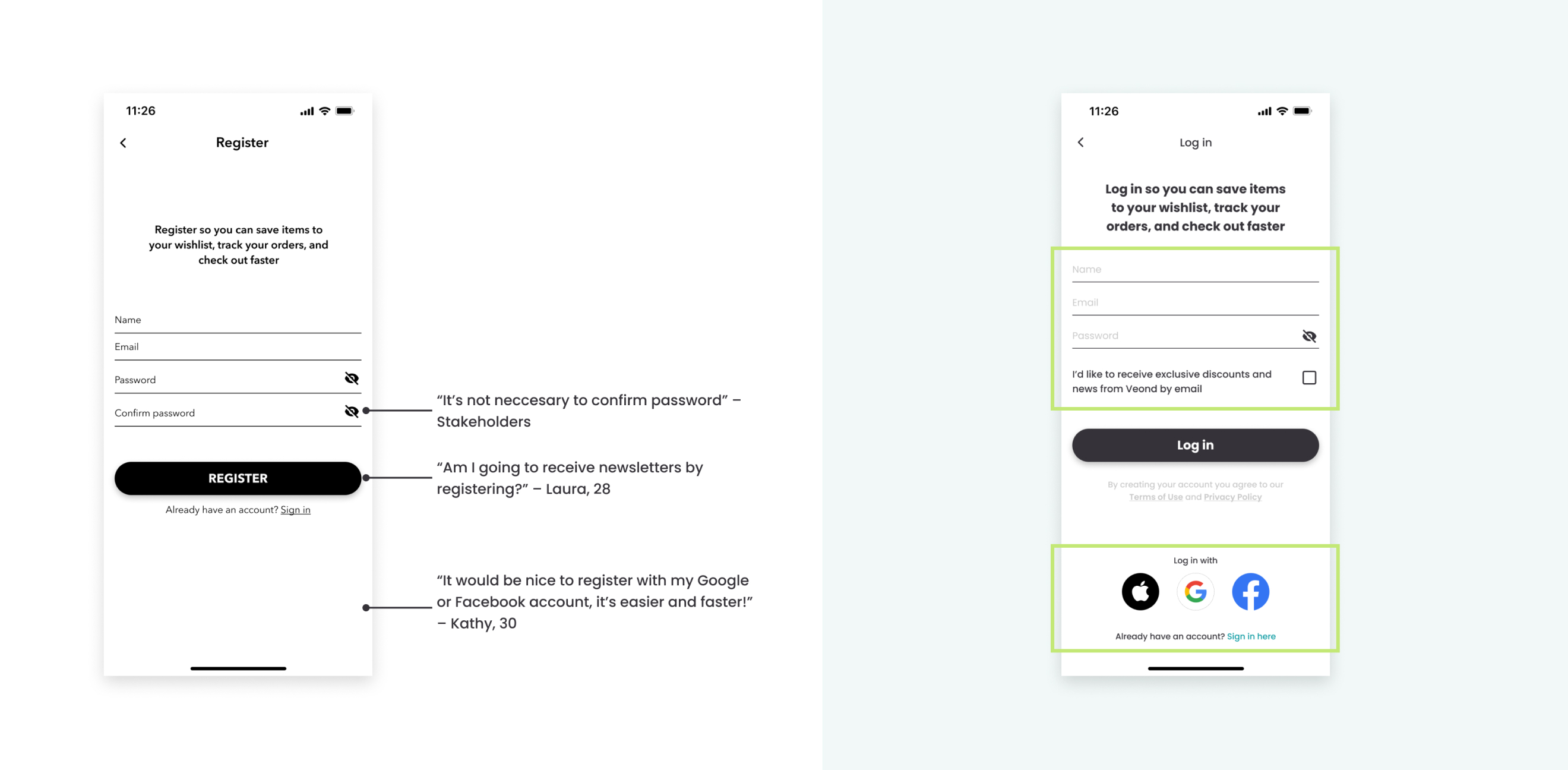
And in the register screen, we removed the password confirmation as our client suggested. Also, we added a checkbox to accept receiving newsletters after the registration. We also included the login or sign-in with other accounts such as Google, Facebook, and Apple.
We wanted to know which impressions caused the new visual design, so we completed a desirability test with 7 users.
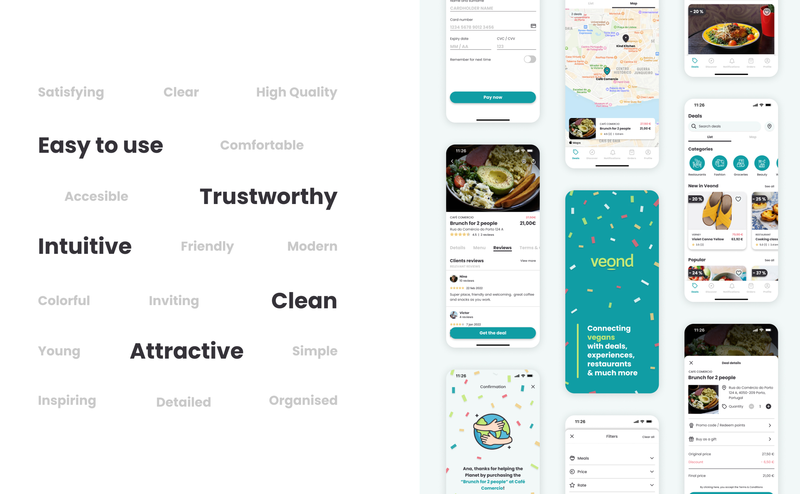
The test outcome was a success. The most repeated adjectives were related to Veond brand attributes or essential attributes for them. So we believe we did a good UI job!
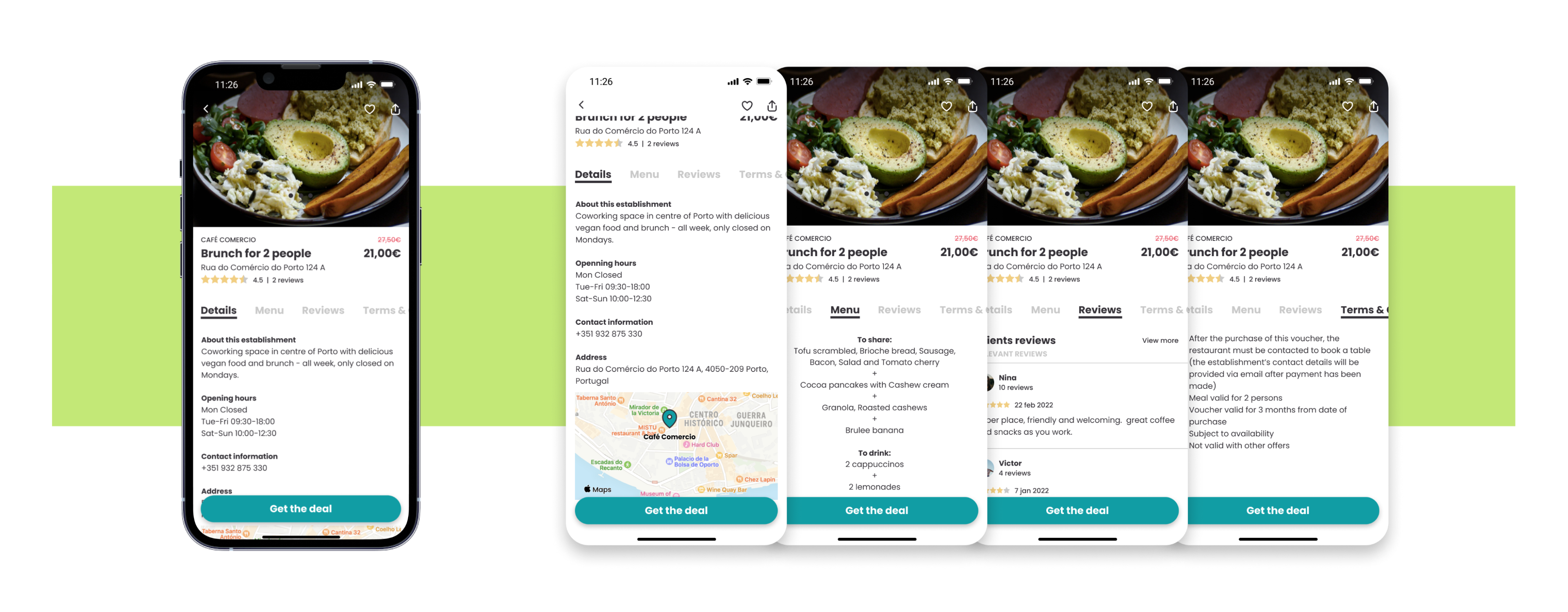
And finally let me show you our solution for Veond’s restaurant check-out.
If you need to get in touch or just say hi!